Context
connexU is a Sydney-based B2B events company that runs marketplace-style conferences (Retail Tech Marketplace, Ecommerce Marketplace, Retail Property Marketplace, and others), connecting senior decision-makers with vendors through curated 1-to-1 meetings. I worked in-house at connexU over the summer of 2026, redesigning connexu.com.au end to end — the site today is a complete rebuild, not a refresh of the old one. I signed a confidentiality agreement covering the engagement, so this write-up sticks to research findings and outcomes rather than design-system or interface specifics — the focus here is on what I learned from users and what changed.
The information architecture didn’t match how visitors actually thought about the site.
Project Location
Sydney, Australia
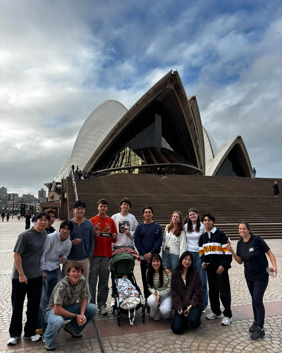
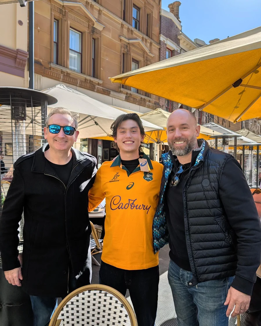
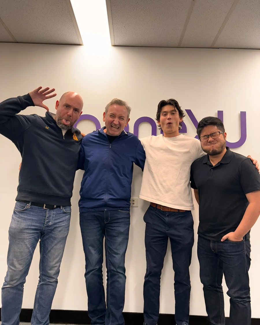
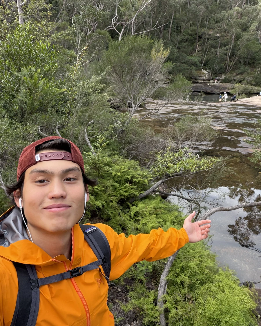
A Few Photos Along the Way

Before touching any screens, I scored the existing site against Nielsen’s ten usability heuristics. Two issues came back High severity, three came back Medium.
Five participants completed ten tasks on the connexU event website. All were generally able to complete most tasks, but experienced repeated confusion — unclear navigation labels, difficulty predicting where information would be located (a mismatch with their mental models of the site), and uncertainty about whether they were following the correct path. Time on task ran substantially longer than expected on several tasks, driven by navigation uncertainty rather than task complexity. In other words, people knew what they wanted to do; the site just made it hard to find the way there, so the redesign set out to clear that path.
P1 — 20, somewhat involved with event registration.
P2 — 21, approaching the site primarily as a first-time visitor.
P3 — 34, a vendor representative evaluating sponsorship options.
P4 — 45, a returning attendee looking for session details.
P5 — 29, exploring event listings on behalf of their team.
Users struggled to locate event registration.
Users experienced confusion when interpreting navigation labels.
Users struggled to locate the event brochure.
Users expected schedule information to be presented differently.
Users demonstrated low confidence while navigating.
The redesign consolidates the navigation down to consistent, plain labels, and adds real secondary conversion paths: each event page now offers "Register your interest," "Download brochure," and a link out to the event’s own site, instead of a single generic CTA. The events index adds sector and year filtering. The contact page now commits to a same-day reply instead of leaving response time unstated. Event and company information is broken into short, scannable stat callouts instead of dense paragraphs, giving each page a clearer visual hierarchy. Taken together, the changes make the site easier to scan and easier to move through.
I signed a confidentiality agreement for this engagement, so I can't post a lot of information here, including the design system. Feel free to email me if you'd like to learn more. I’m always happy to talk through the process and the research behind the redesign, within the limits of the agreement that we signed.
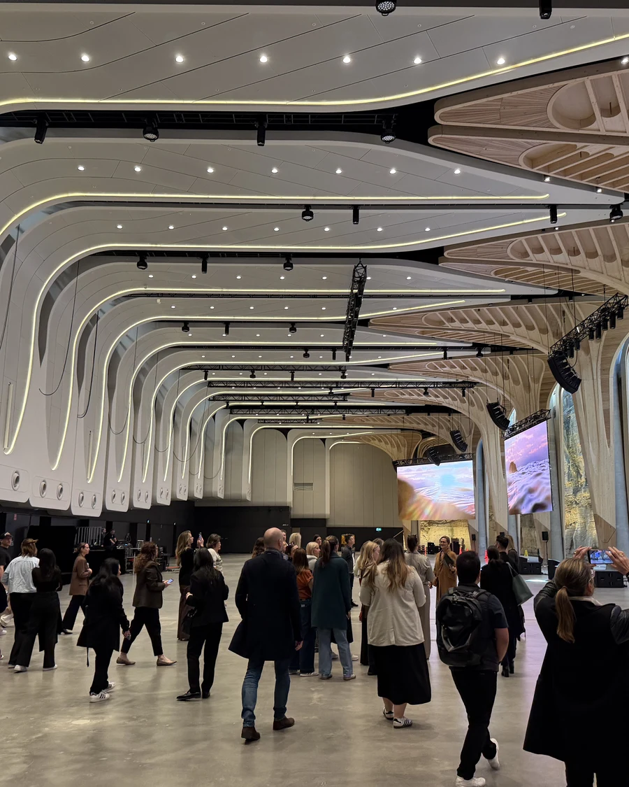
View Full SiteWorking in-house for the summer meant experiencing Sydney beyond the office too — 5 a.m. run clubs before the workday started, a Christmas in July celebration in the middle of the Australian winter, and a trip up to the Great Barrier Reef, one of the most precious settings on Earth.
I’d want to re-run the same set of usability tasks against the live redesign to close the loop with real user data instead of inferring from the shipped structure, and use that to prioritize the remaining agenda-detail gap. That would show which changes are working and where the next round of improvements belongs.