Guide
Context
What is the Guide App?
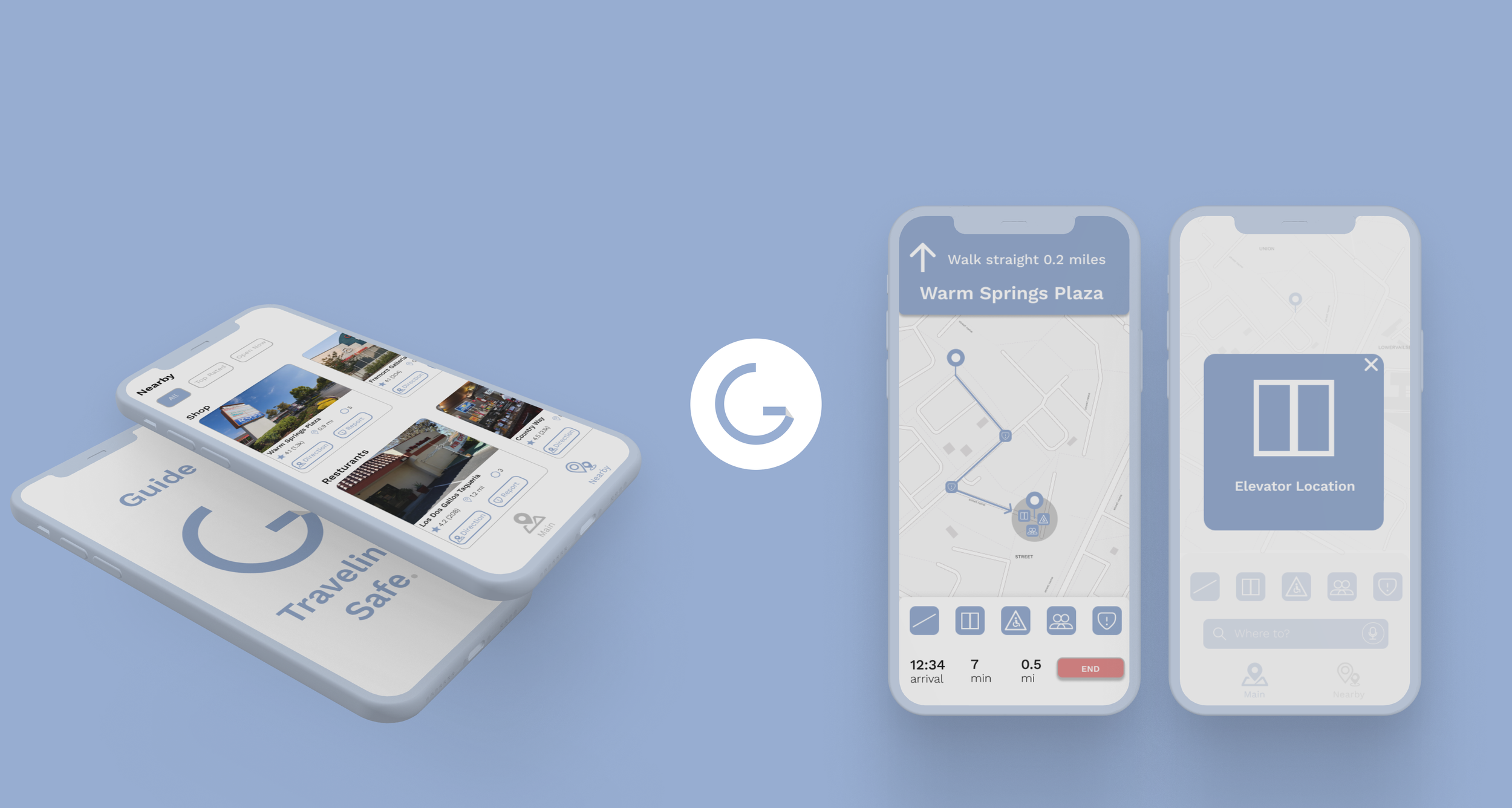
Guide is a mobile navigation app designed specifically for wheelchair users to promote safer, more accessible travel. The app helps users identify key accessibility features in real time, including elevators, ramps, handicapped restrooms, and areas with high foot traffic. Guide focuses on three core functions: mapping out ADA compliant routes, alerting users to potential obstacles or crowd density, and highlighting nearby accessibility features to support on-the-go decision making — all in one place, so users always know what to expect along their route and can plan each trip.
Why This Project
Personal to Me
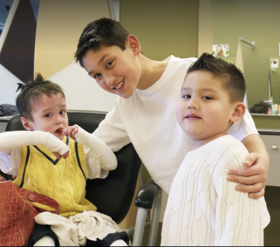
Growing up, two of my brothers, Nate and Jake, both used wheelchairs. They lived with epidermolysis bullosa, a condition that leaves the skin extremely fragile and prone to blistering which made even short trips outside the house genuinely difficult to plan for and navigate, so every outing took extra planning ahead of time.
As their brother, I realized how often people with disabilities are left out of everyday experiences and how rarely that gap gets addressed. Guide is my attempt at equity-focused design: building for a group that products have historically overlooked. When I became a designer, Guide had been an idea I had been thinking about for many years. It's the most personal project in this portfolio, and there's genuine intent behind it: making independent travel a little less uncertain for people who don't have the luxury of assuming a route will simply work for them.

How can I help users in wheelchairs feel confident while traveling, especially alone?
The Challenge
- 01
Determining what obstructions were most important to cover during travel.
- 02
How to exactly show/notify users of an elevator location or other important landmark in their path.
- 03
Designing for users who may be traveling quickly or unable to analyze all the content on their phone.
User Research
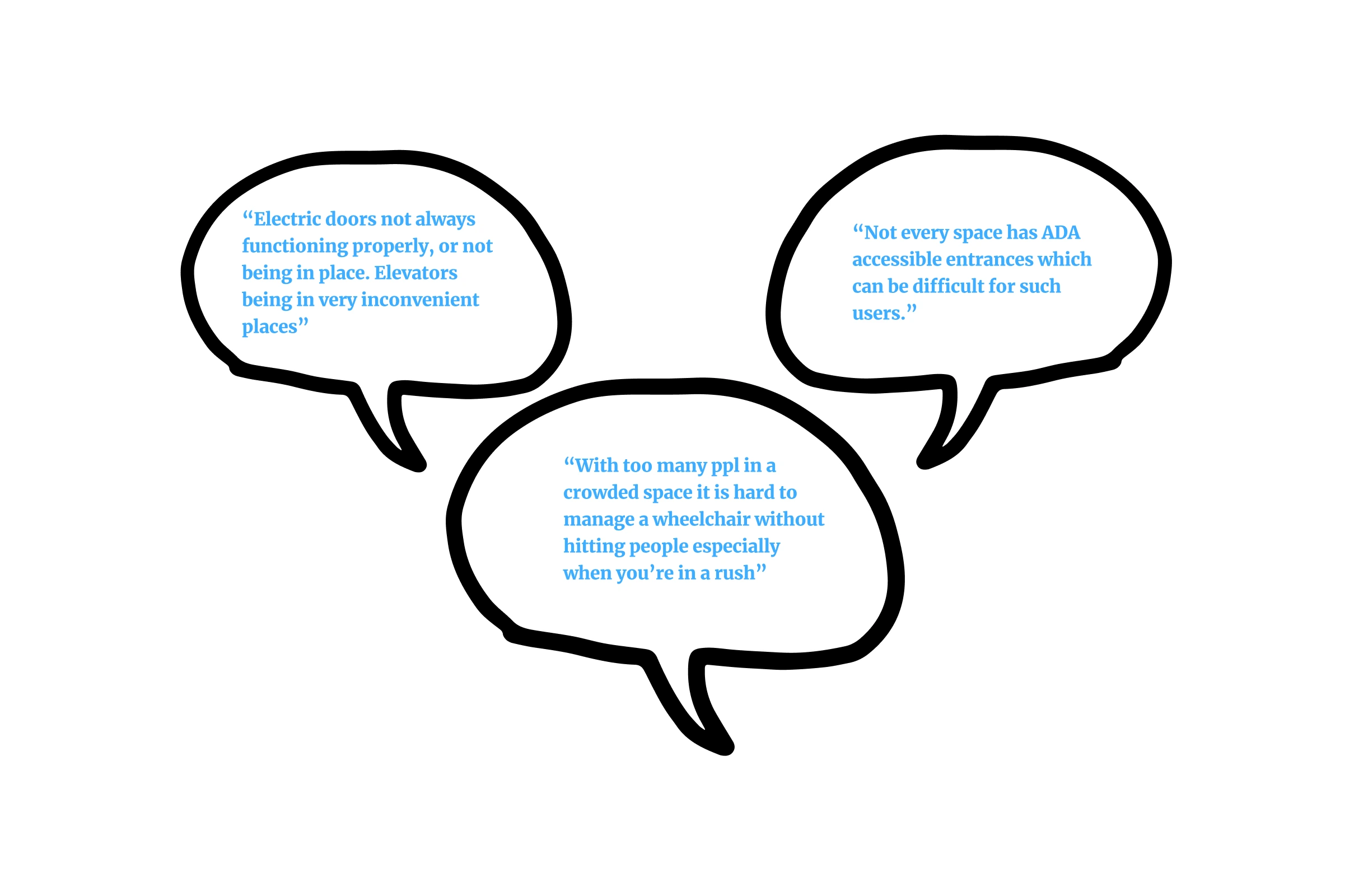
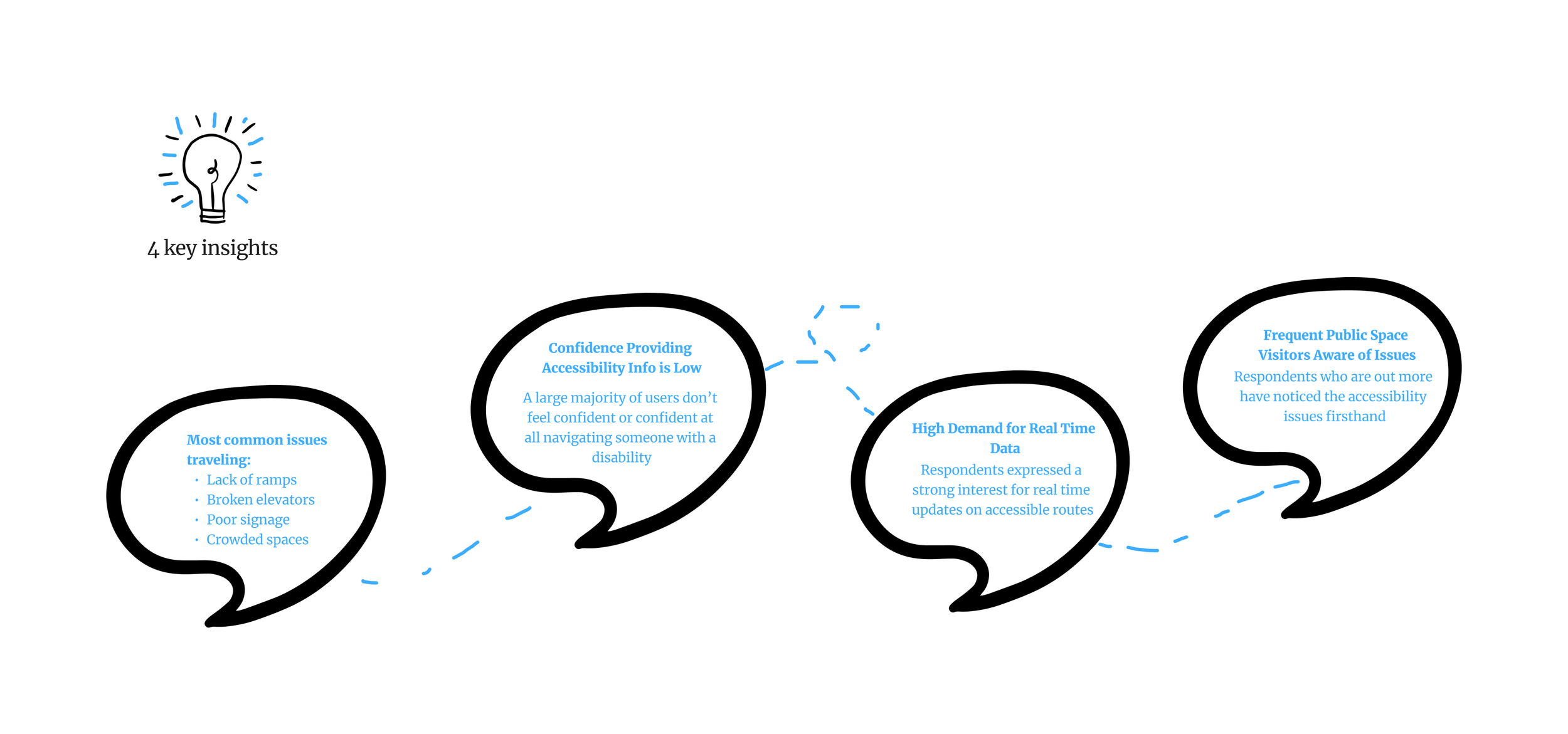
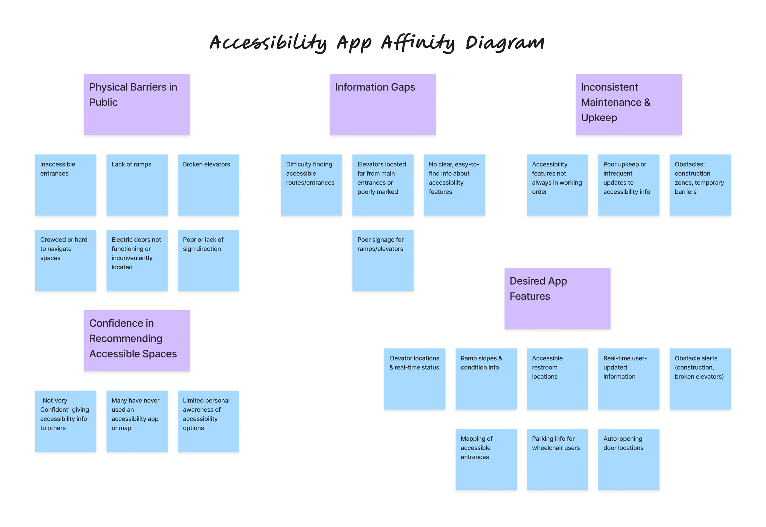
I paired a survey (20+ responses) with interviews of people who either have a disability or frequently travel with someone who does, combining quantitative reach with qualitative depth. Their feedback highlighted common frustrations around inaccessible pathways and the lack of reliable information when planning routes. Those conversations shaped every decision that followed, from the features I chose to how each one is presented on screen and how they fit together.
Key Insights
Survey Results
Knowledge
- No
- Yes
"Have you ever used an app, map or website that included accessibility information about a public space?"
Confidence Level
- Not Very Confident
- Somewhat Confident
- Other
"If a friend/family member asked you for advice about which public spaces are accessible, how confident would you feel giving them accurate info?"
The Challenge
- 01
Determining what obstructions were most important to cover during travel.
- 02
How to exactly show/notify users of an elevator location or other important landmark in their path.
- 03
Designing for users who may be traveling quickly or unable to analyze all the content on their phone.
User Personas
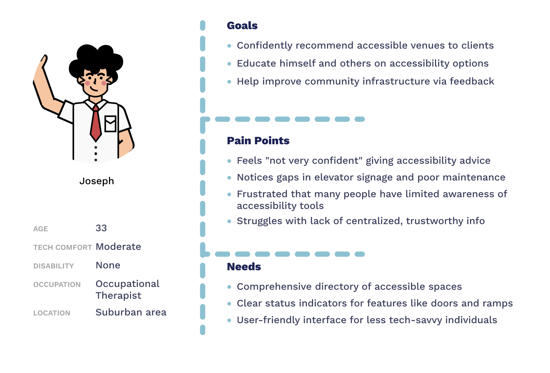
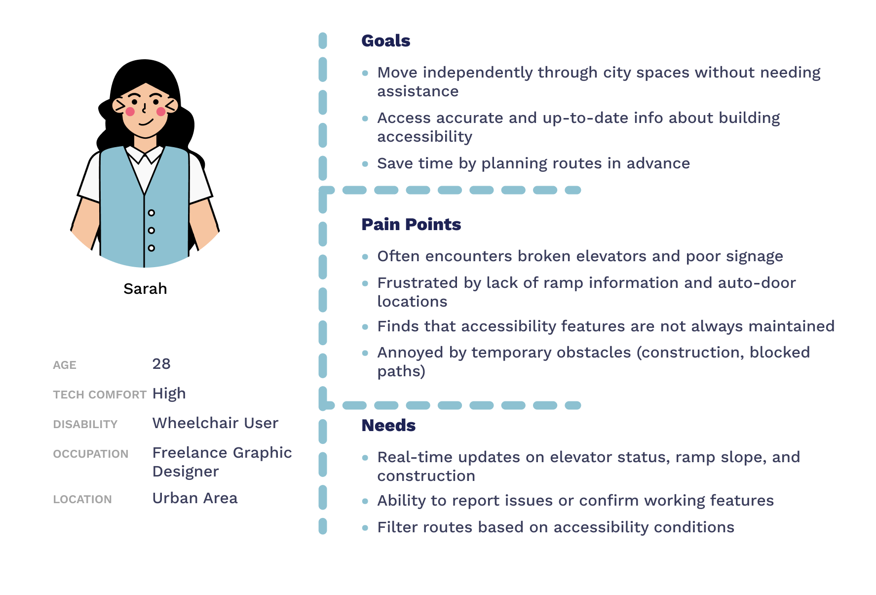
Upon analyzing my research, I developed user personas expressing their goals, frustrations, and pain points — helping me understand the diverse needs of both wheelchair users and those who support them, which kept real people's needs in front of me during the whole design process and kept the work grounded.
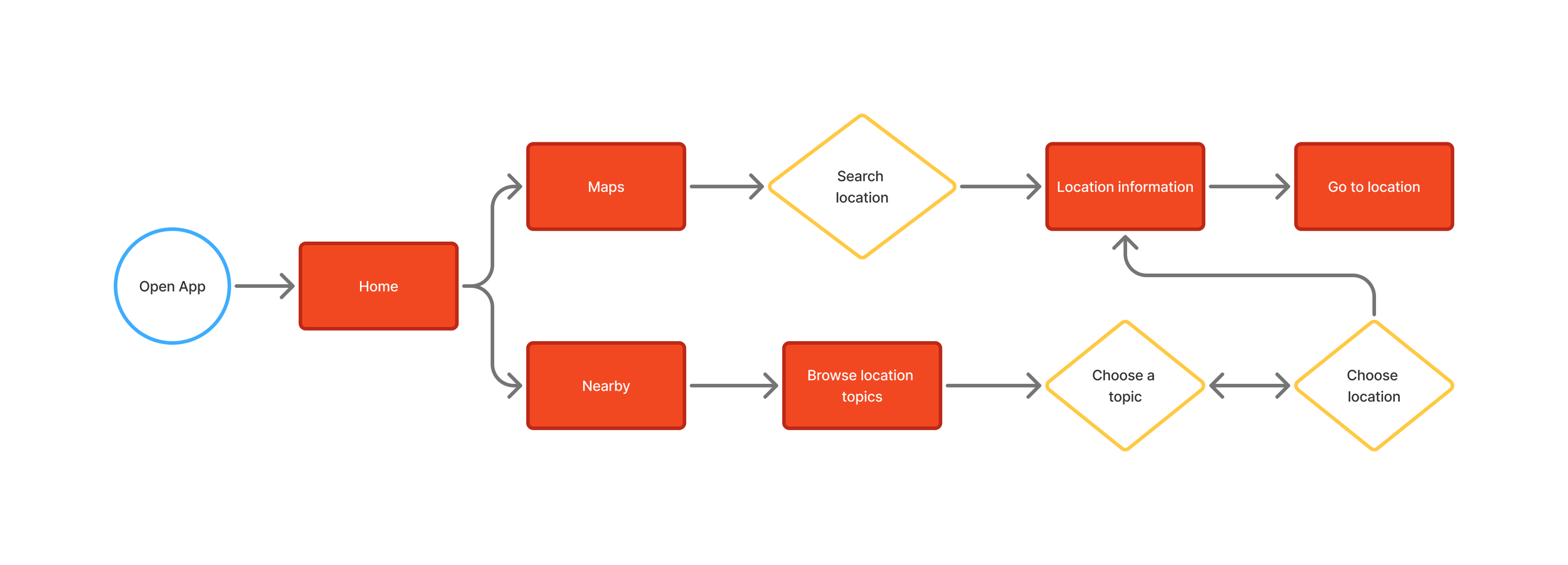
Mapping the Flow
Low-Fidelity Prototypes
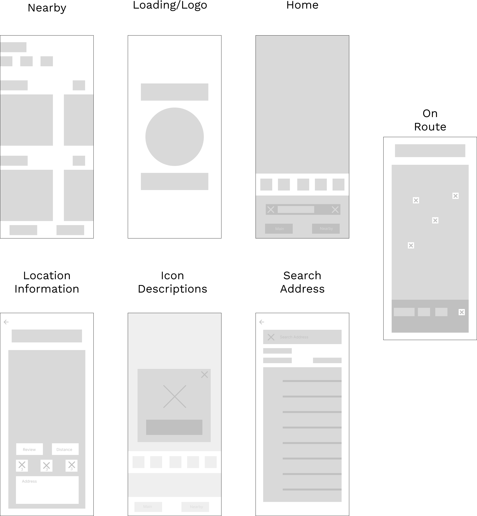
Based on user feedback and ideation, I sketched low-fidelity wireframes to explore flows, layouts, and features — validating what accessibility information users needed most and how they preferred it presented. These early sketches were quick to make and easy to change before any visual polish was added.
The Challenge
- 01
Determining what obstructions were most important to cover during travel.
- 02
How to exactly show/notify users of an elevator location or other important landmark in their path.
- 03
Designing for users who may be traveling quickly or unable to analyze all the content on their phone.
Navigation Page Iteration
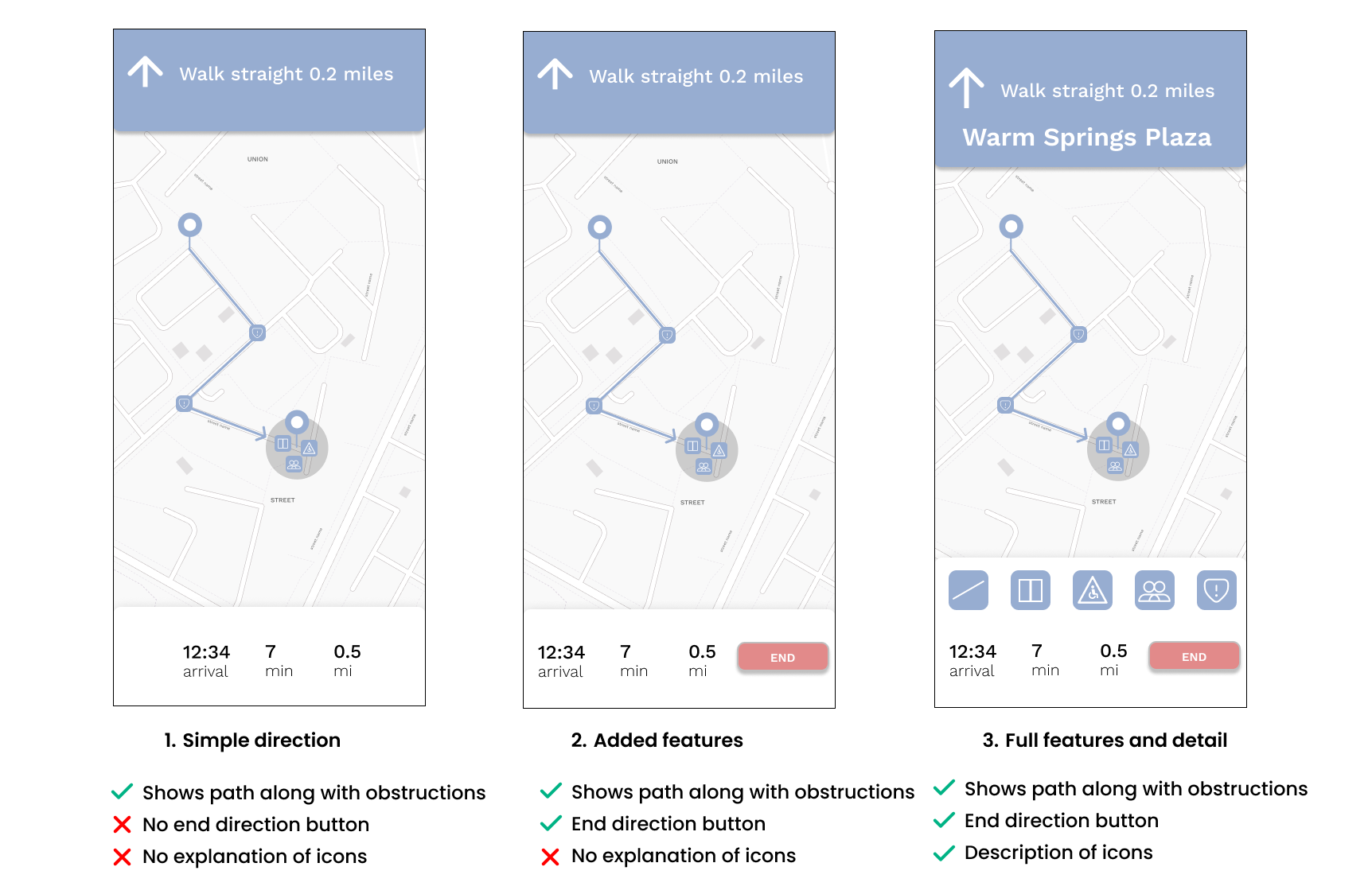
The first version showed the path and obstructions but lacked an end button and didn't explain the iconography. I chose Option 3 for its combination of functional completeness and improved clarity — the version that best matched what users needed on the route in the moment, without adding extra steps.
Location Page Iteration
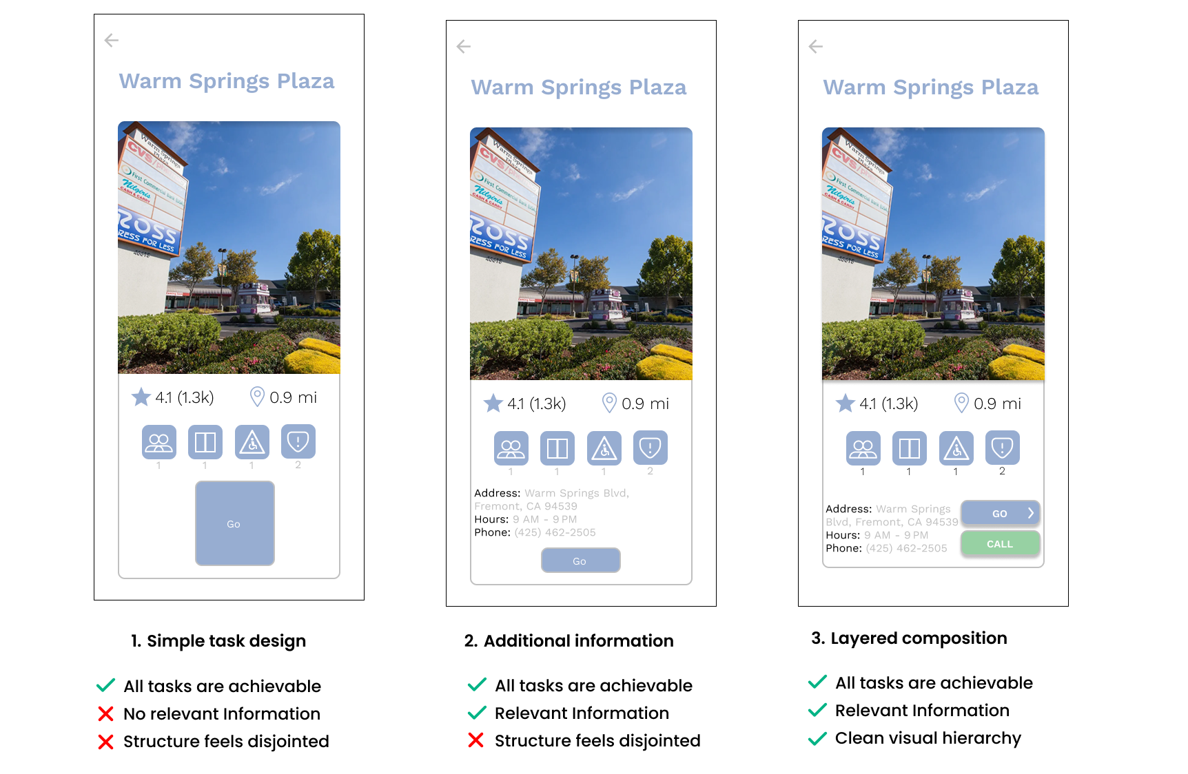
Option 1 lacked key information like address or hours. I selected Option 3 for its clear hierarchy, layered composition, and action-oriented layout — testing showed the dedicated "Call" button, a clear call-to-action, improved task completion, which made the next step obvious the moment someone reached the page.
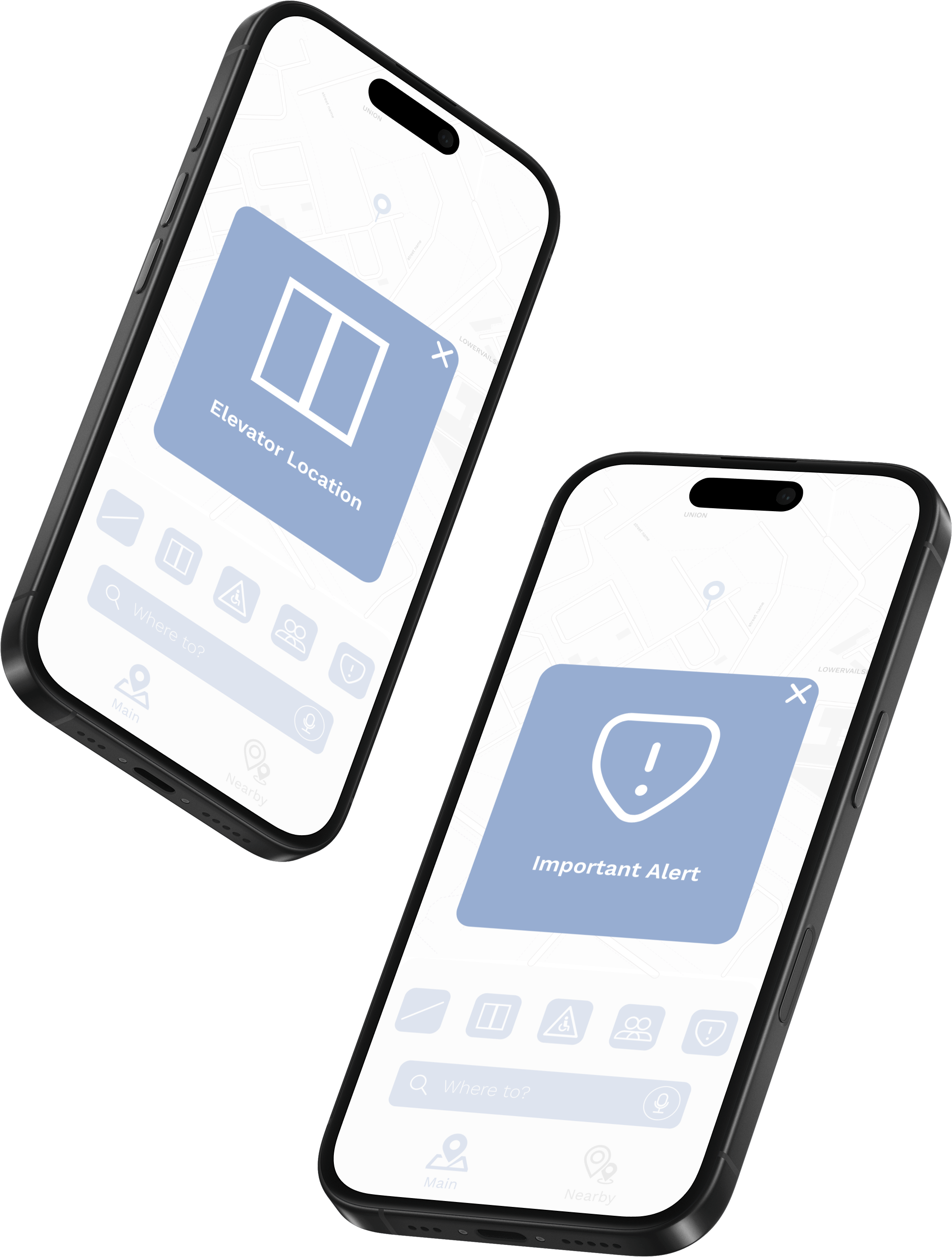
Solved Pain Points
During the design process, I identified the most effective way to clearly communicate the accessible features of a route. I incorporated five main pinpoints along a route: elevators, ramps, large crowds, handicapped bathrooms, and an additional feature to report something. Together these pinpoints let users read a route at a glance before they set off.
- Elevators
- Ramps
- Crowds
- Bathrooms
- Report
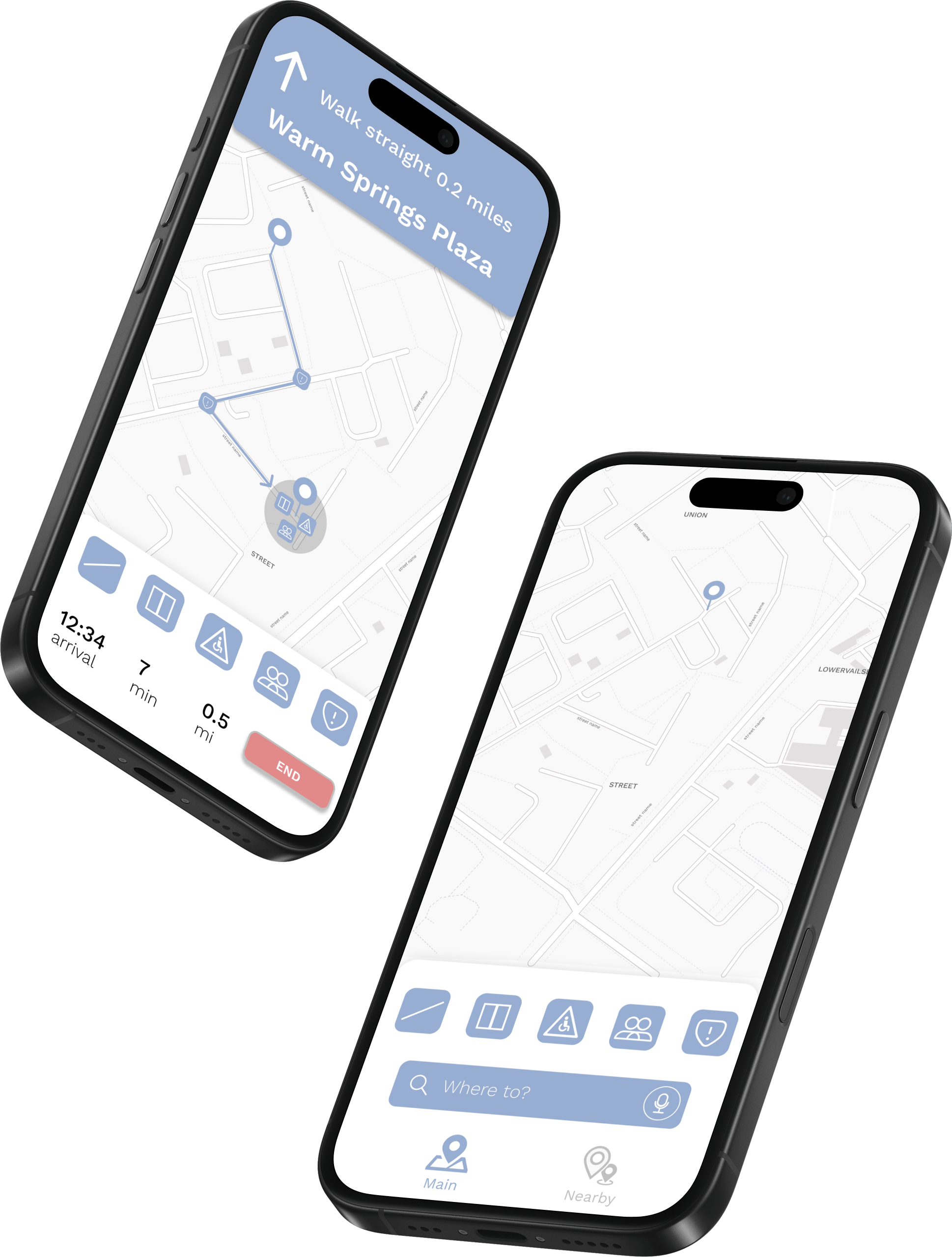
Built on Trust
To build trust and confidence for the user, the app only surfaces the most accessible route with the least detours or interruptions, prioritizing paths that are well-maintained, clearly marked, and verified by recent user feedback. Users can view detailed information about each route, including elevator status, ramp conditions, and any reported obstacles. This ensures they can travel with greater independence, certainty, and reduced stress in unfamiliar environments. Every detail is meant to make each route feel reliable and clear.
- Elevator Status
- Ramp Conditions
- Reported Obstacles
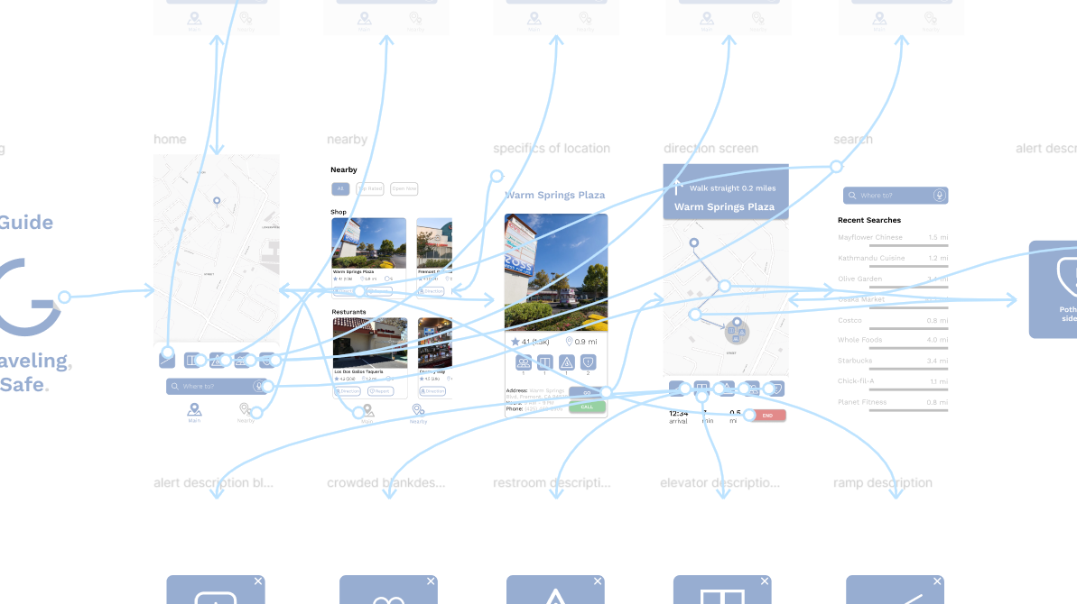
Final Prototype
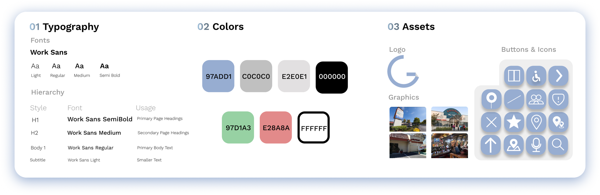
Design Kit
Reflection
Working on this project deepened my understanding of how digital products can bridge gaps in accessibility in the real world. Designing for users in motion challenged me to simplify everything down to the essentials, focusing on core needs. That mindset shaped every screen I designed and every decision behind it.
Taking on this solo UX project gave me the chance to lead every stage, from research to prototyping. I not only strengthened my design process, but developed a deeper awareness of the daily navigation challenges people in wheelchairs face. This project holds meaning to me — something very personal — and I'm glad it worked out well and that I got to see it through from start to finish, from the first survey response to the final prototype and everything in between.