Michigan
ChatGPT
Context
What is the Michigan Chat-GPT?
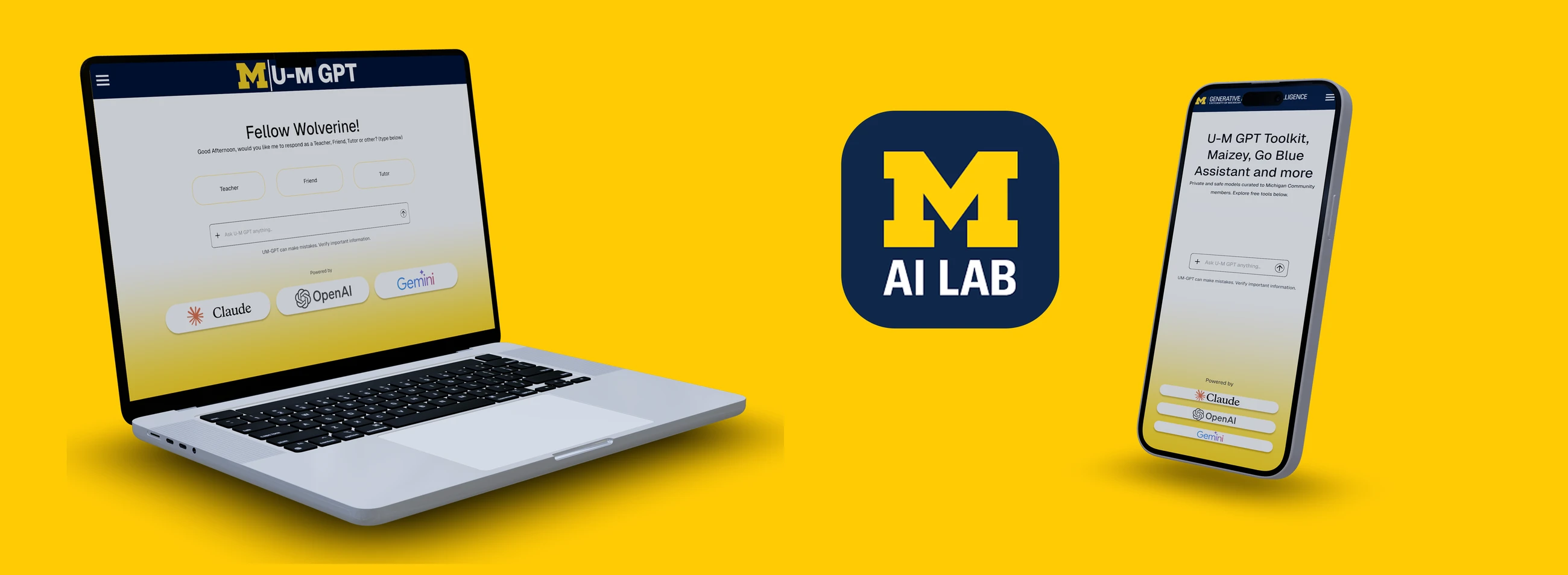
Michigan ChatGPT is the University of Michigan's AI workspace: a collection of tools like U-M GPT, Maizey, Go Blue, and GPT Toolkit designed to help students, faculty, and staff find information, generate content, and access campus support. It is the first university to implement LLM tools curated just to their community. However, despite the power of the underlying models, the platform's interface had fallen behind — outdated, visually cluttered, and inconsistent with modern design patterns, hence this work.
This redesign centers on creating an intuitive, accessible, and highly personalized experience tailored specifically for the University of Michigan community. The goal is to provide students, athletes, and faculty with a seamless way to ask questions, explore resources, and receive meaningful support — all within a workspace that feels cohesive and efficient. By enhancing clarity, reducing friction, and introducing smarter interaction patterns, the new design supports users in getting the right information at the right moment. Every decision in the redesign points back to that goal, from the first screen to the last interaction.
How can I reduce unnecessary friction for both new and returning users?
Project Location
Ann Arbor, Michigan
The Challenge
- 01
Communicating the purpose of multiple AI tools without overwhelming users.
- 02
Simplifying scattered navigation patterns into one cohesive experience.
- 03
Designing for both first-time visitors discovering tools and returning users who already know where they're going.
What Students + Faculty Told Us
I conducted surveys and interviews with Michigan students who use campus technology regularly. Their feedback surfaced major pain points: Difficulty understanding what each AI tool does; Low confidence navigating between services; Reliance on external AI tools due to confusion on Michigan's offerings; Lack of visual hierarchy or familiarity in the interface. Users expressed the need for transparency, clarity, and a trusted Michigan-branded experience.
- Users felt overwhelmed by unclear terminology and too many competing tools.
- Familiarity and simplicity dramatically increase trust in digital systems.
- Navigation must be clean, predictable, and consistent across the experience.
As a First-Time Visitor, I Should Be Able To:
- Immediately understand that MichiganGPT is a suite of U-M AI tools
- Learn what each tool does and which one fits my need
- Navigate comfortably through a clean, familiar, Michigan-branded workspace
As a Returning Visitor, I Should Be Able To:
- Jump straight into the tool I use most
- See updates, announcements, or new features
- Access documentation, support, or login in one click
The Challenge
- 01
Communicating the purpose of multiple AI tools without overwhelming users.
- 02
Simplifying scattered navigation patterns into one cohesive experience.
- 03
Designing for both first-time visitors discovering tools and returning users who already know where they're going.
Design Principles
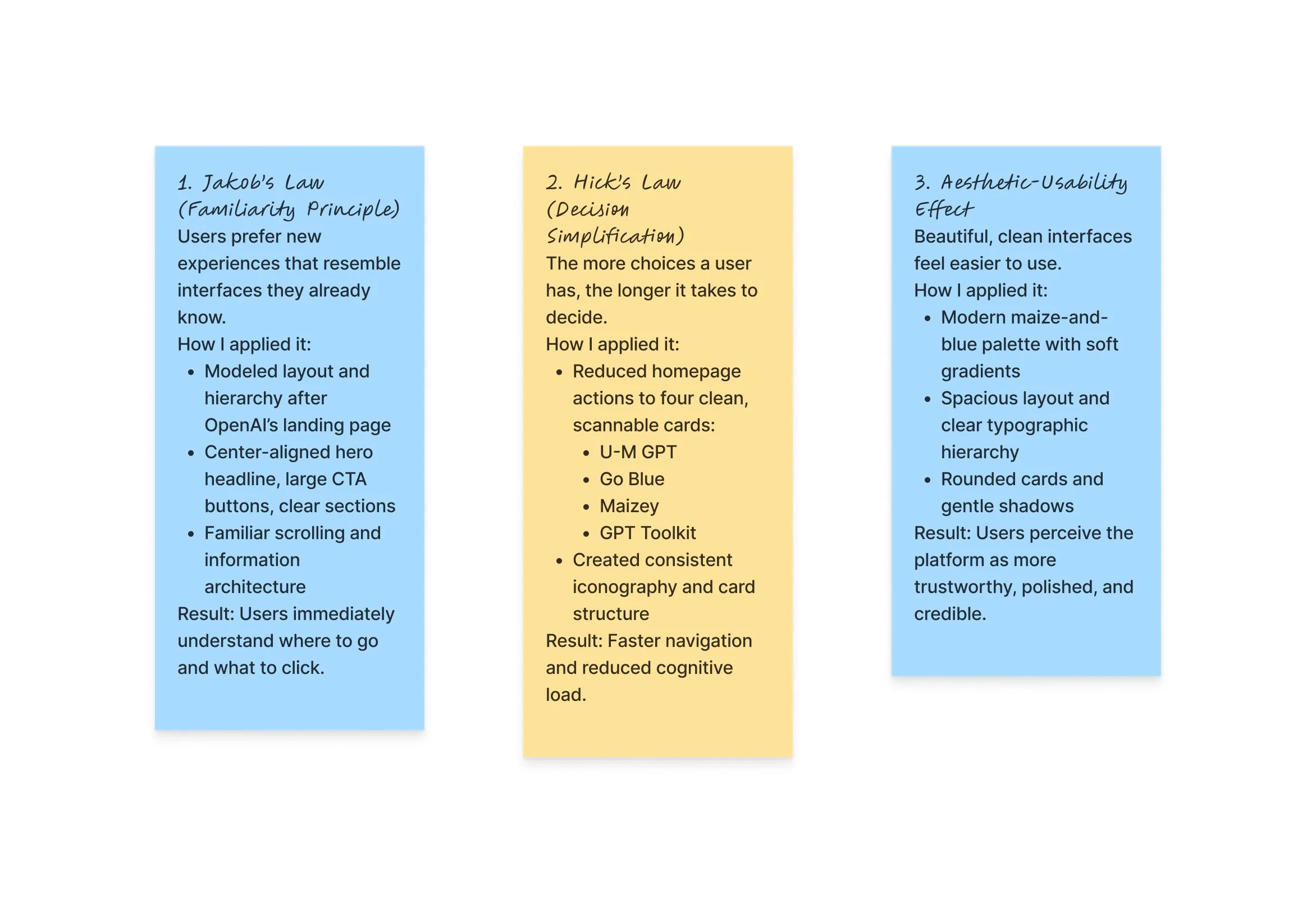
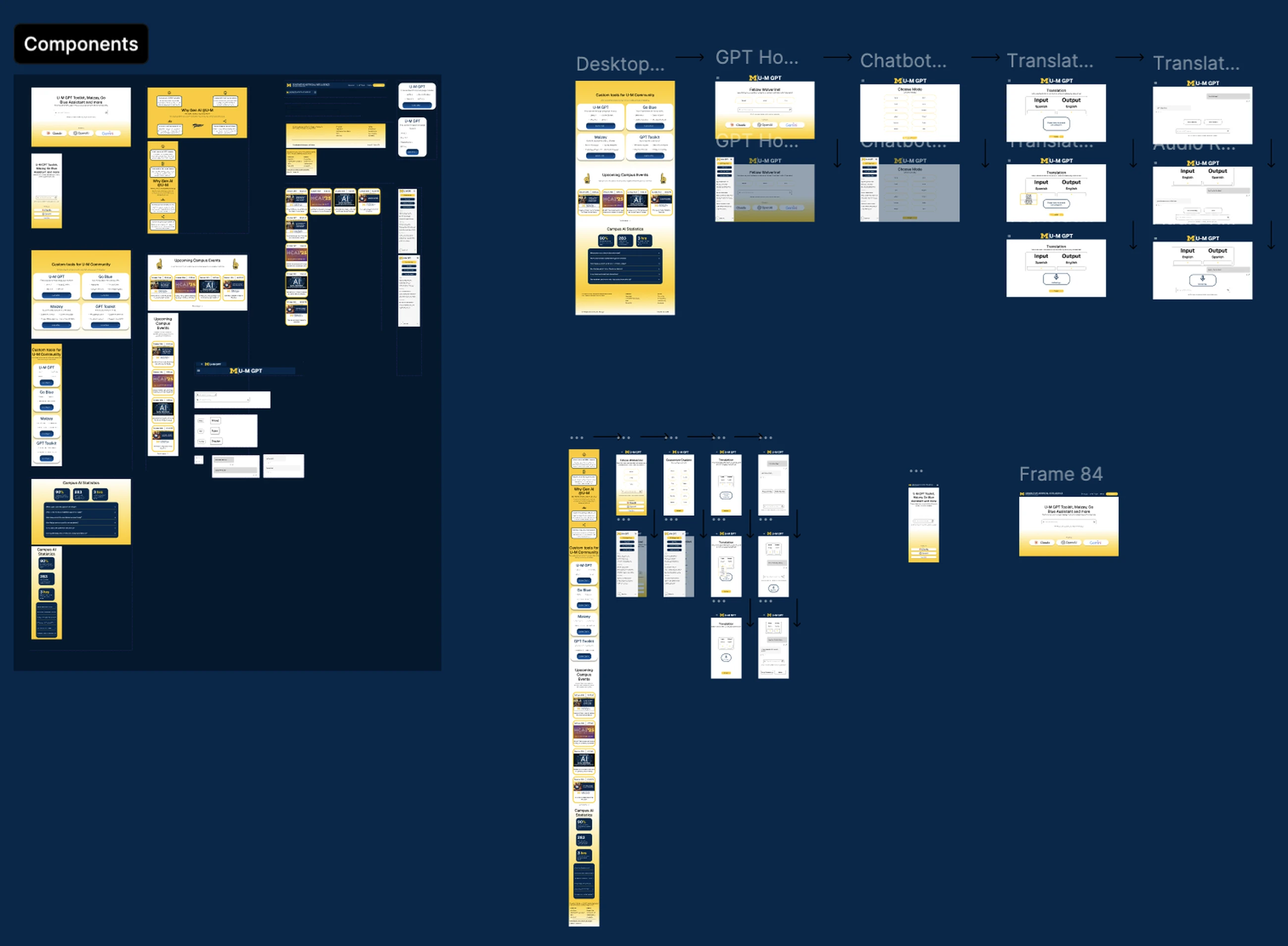
I began with an audit of the existing Michigan ChatGPT experience to identify areas of friction. Early sketches explored how to present tool categories more clearly, simplify the homepage, and introduce stronger visual hierarchy. Mapping the original user flow helped me reorganize the information architecture into a cleaner structure with fewer decision points. Three UX principles shaped the redesign — Jakob's Law, Hick's Law, and the Aesthetic-Usability Effect. A responsive layout grid, four columns on mobile and twelve on desktop, keeps components consistent across screens. Together, these choices give it a steady base across screens.
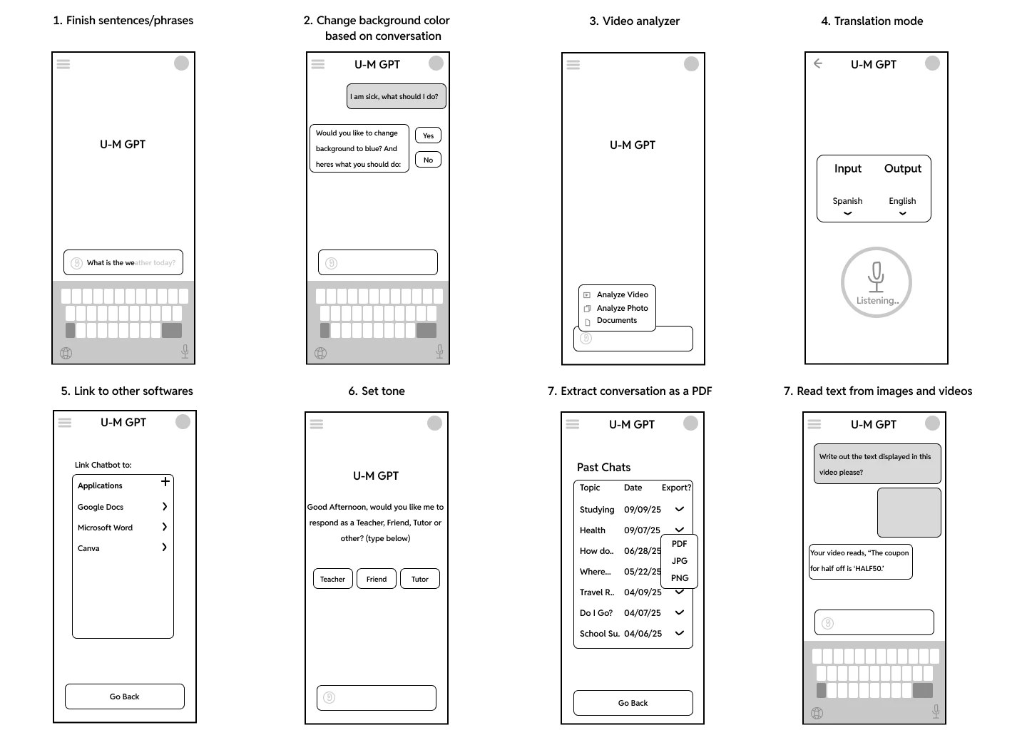
Low-Fidelity Prototypes
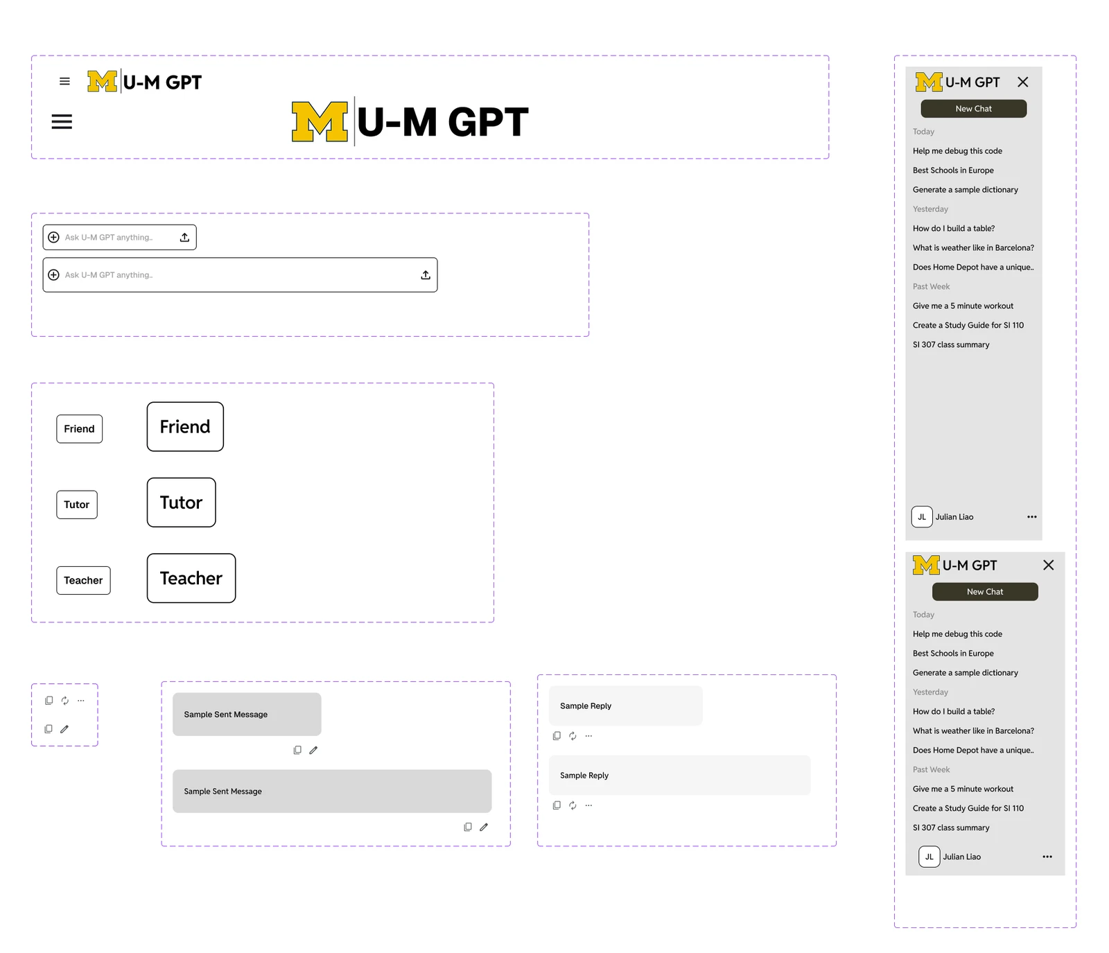
Initial wireframes explored hero layouts, card structures, and sidebar navigation. These early concepts helped test how much information should appear above the fold and how users interpreted the purpose of each AI tool. Through iterations, I refined the layout to balance simplicity with clarity with each pass.
The Challenge
- 01
Communicating the purpose of multiple AI tools without overwhelming users.
- 02
Simplifying scattered navigation patterns into one cohesive experience.
- 03
Designing for both first-time visitors discovering tools and returning users who already know where they're going.
Filled Landing Page
The filled landing page presents all core MichiganGPT tools in a clear, structured layout that reduces cognitive load and eliminates guesswork for first-time users. By emphasizing a strong hero section and four primary action cards, users can immediately understand what the platform offers and where to begin — establishing clarity, trust, and a consistent visual hierarchy across the experience, so every visit starts from the same clear place each time.
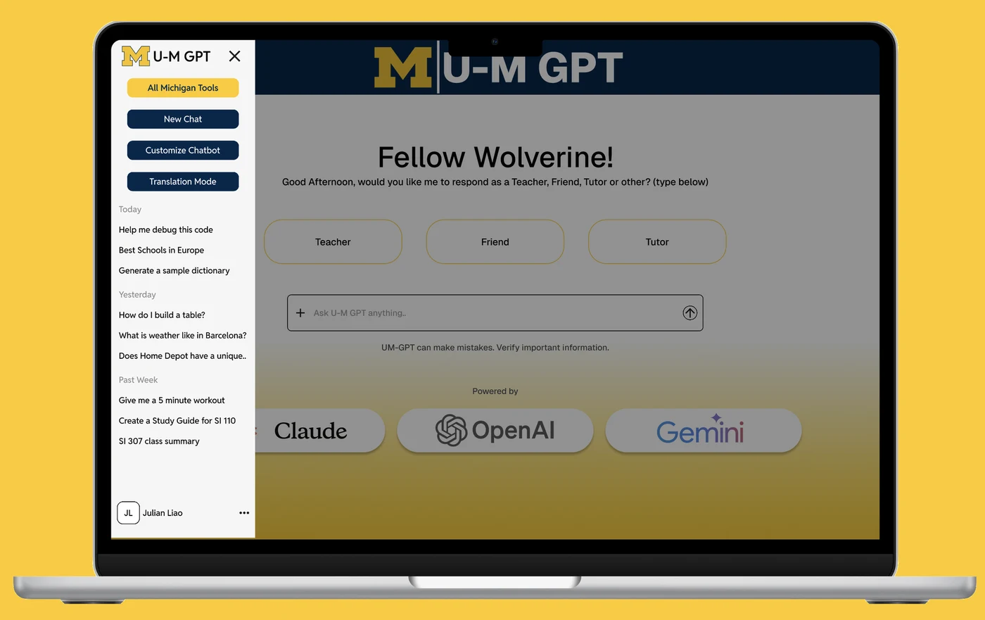
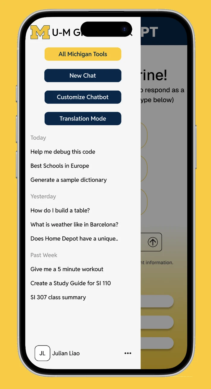
Accessible Sidebar
The redesigned sidebar organizes tools, resources, and support into intuitive categories, making navigation predictable and easy to scan. Larger tap targets, readable labels, and consistent iconography improve accessibility for users browsing quickly or on smaller screens — a simpler, more reliable method for returning users to get to what they need without friction — helping the whole platform feel calmer, clearer, and easier to use.
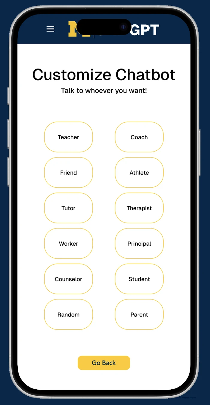
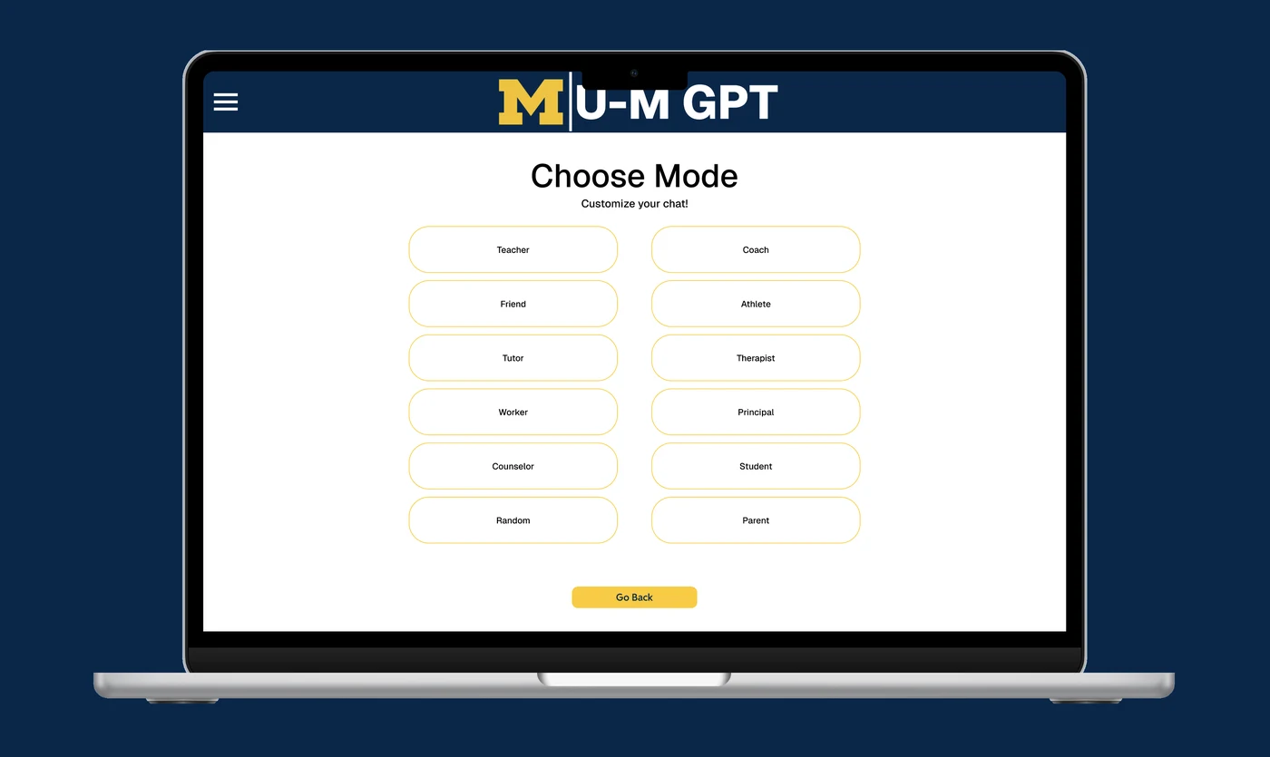
Curated Responses
Curated responses offer high-quality, context-aware guidance built specifically for academic, research, and campus-related tasks. This feature increases trust by helping users get more accurate and relevant answers without needing to refine prompts repeatedly — it also supports new AI users who may be unsure how to phrase questions effectively.
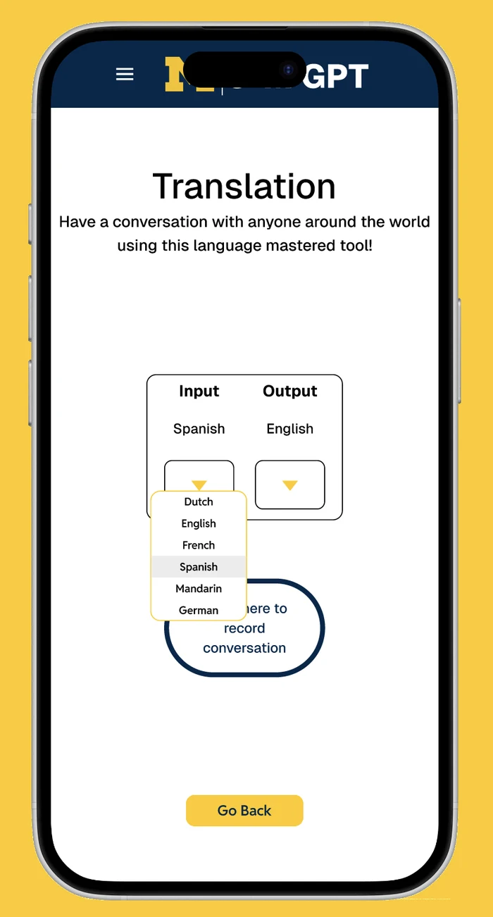
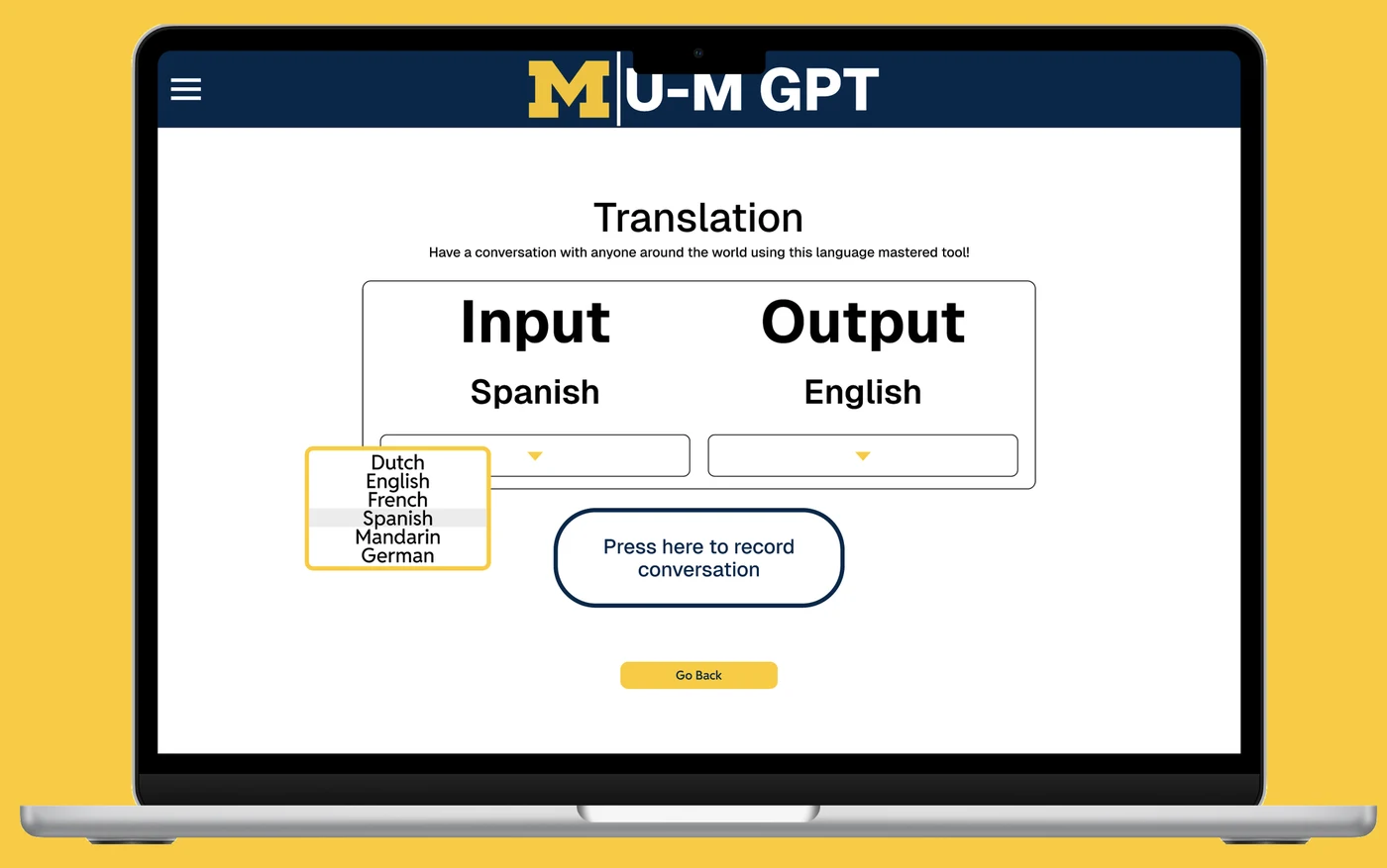
Translation Mode
Translation Mode introduces multilingual support, ensuring that international students and multilingual community members can access MichiganGPT in the language they understand best. This reduces barriers to information and enhances equity across the platform, and helps users communicate more confidently in academic or administrative tasks — a small change that makes the platform feel welcoming to more of the community.
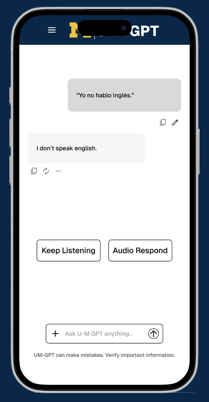
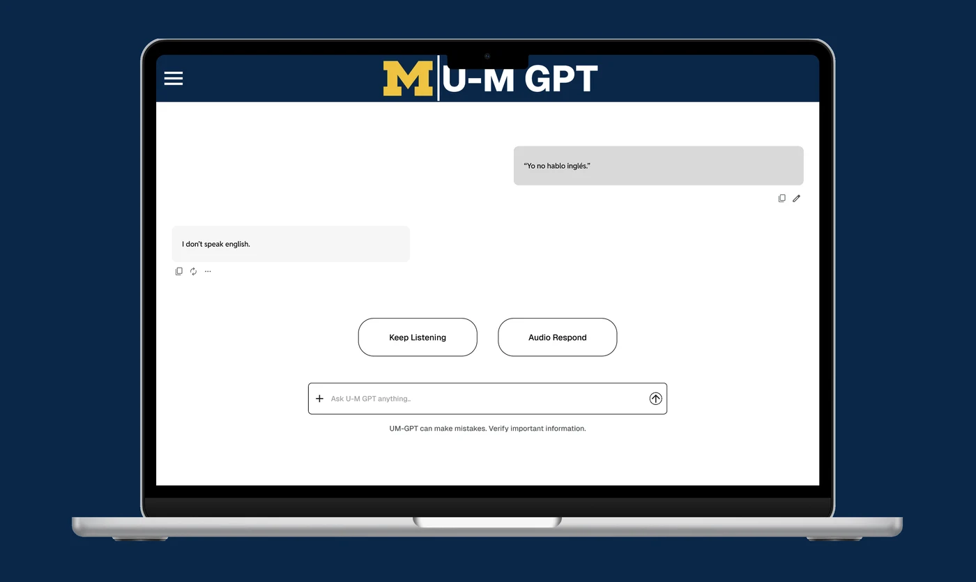
Audio Feedback
Audio Feedback enhances accessibility by allowing users to hear responses, interface confirmations, and key actions without relying entirely on visual cues — particularly helpful for users with visual impairments or those multitasking while using the platform. It makes the system more inclusive and flexible for diverse user needs and easier for many to use.
The Brand
Digital
Presence.
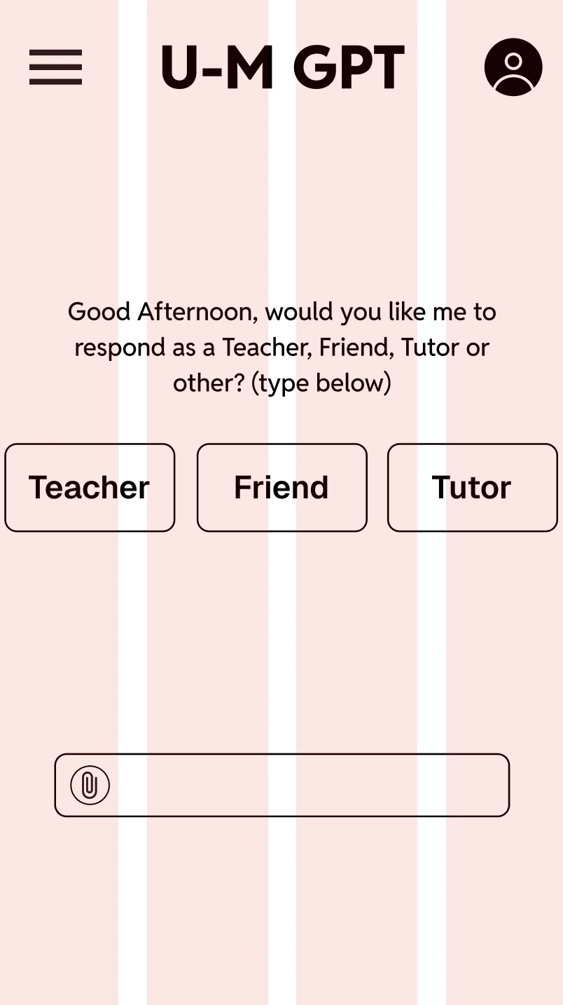
Columns
4
Type
Stretch
Gutter
16
Margin
0
Width
Auto
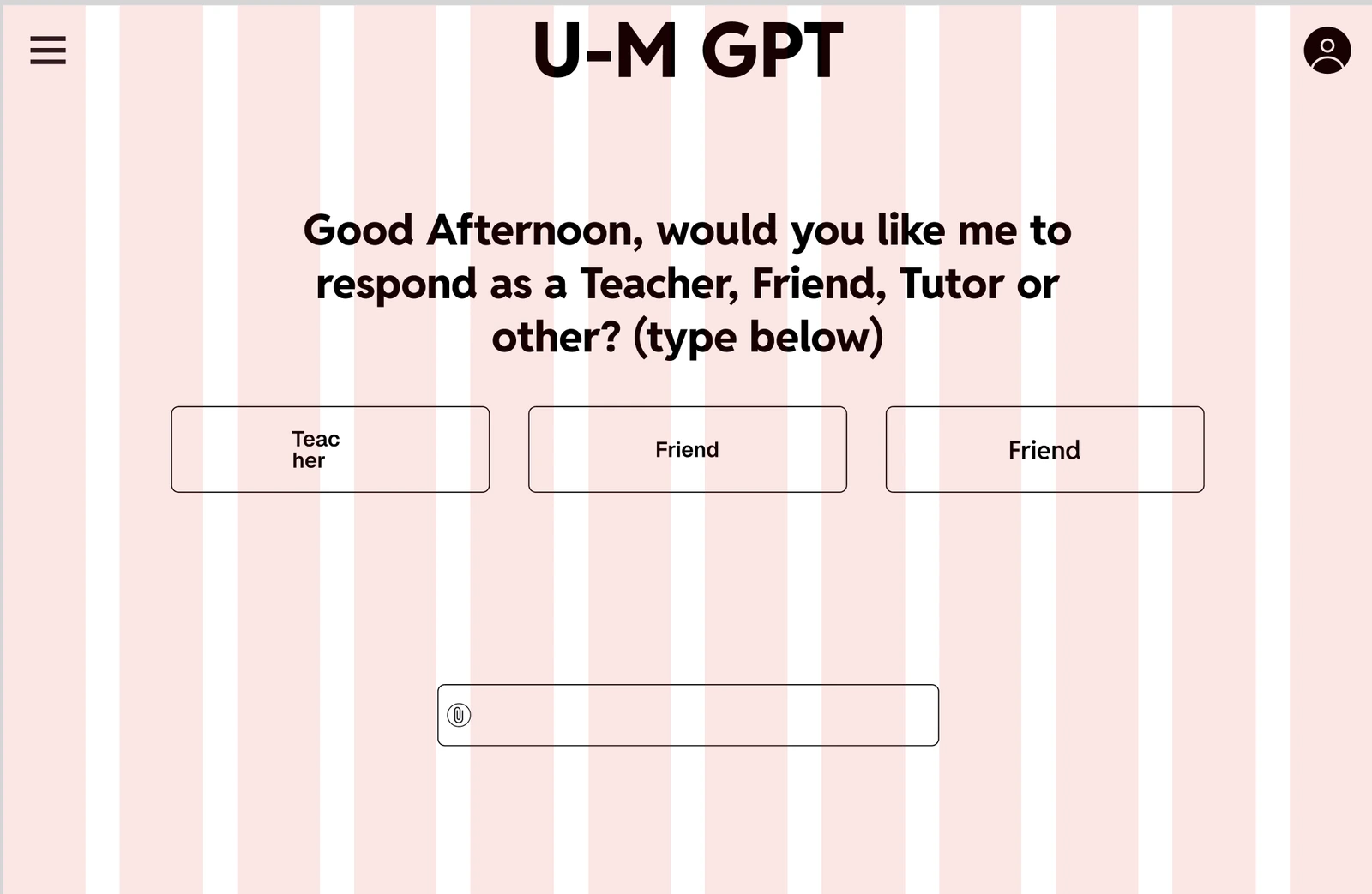
Columns
12
Type
Stretch
Gutter
12
Margin
0
Width
Auto
Reflection
- Clear hierarchy and predictable patterns
- Cards for each AI tool, evenly spaced and highly scannable
- Strengthened Michigan branding without overwhelming the UI
- Accessibility upgrades for legibility, navigation, and recognition
- Trust-building elements such as curated responses and user-centered features
The redesigned system helps students and faculty feel confident using Michigan's AI ecosystem — whether they're writing, researching, asking questions, or seeking campus help. The goal throughout was a platform people can trust at a glance and return to without thinking twice, whether it is a first visit or a return.
Working on this redesign broadened my understanding of how clarity, psychology, and visual design shape user trust. Taking the entire project from research to high-fidelity prototypes helped me refine my process and uncover opportunities to improve Michigan's digital ecosystem for the people who rely on it every day.
- A full documentation experience
- A personalized dashboard based on user history
- Better integration with academic tools across campus
This project holds personal meaning — Michigan is my community. Creating a cleaner, more supportive AI workspace helped me contribute to something students use every day — and to make it easier for my whole community to find what they need, when they need it, in a space that feels clear and welcoming.