Guide Mobile Application
Timeline
4 weeks
Role
UX Designer UX Researcher
Tools
Figma FigJam
Team
Just me!
ContextWhat is the Guide App?
Guide is a mobile navigation app designed specifically for wheelchair users to promote safer, more accessible travel. The app helps users identify key accessibility features in real time, including elevators, ramps, handicapped restrooms, and areas with high foot traffic. Guide focuses on three core functions: mapping out ADA compliant routes, alerting users to potential obstacles or crowd density, and highlighting nearby accessibility features to support on-the-go decision making. Built for real world use, Guide emphasizes clarity, speed, and ease of use, prioritizing functionality over complexity to foster independent and confident movement.
Skills
Wireframing Prototyping Design Systems Interaction Design User Research
Project Vision
Navigating urban environments in a wheelchair often comes with unexpected challenges. Many navigation tools overlook these barriers, leaving users without the information they need to travel safely. The vision behind Guide was to create a streamlined, accessibility first app that empowers wheelchair users with present visibility into obstacles and accessible features. As someone who traveled frequently with a wheelchair user, the goal was to reduce friction during travel and promote greater independence through a simple experience.
Challenges
1) Determining what obstructions were most important to cover during travel.
2) How to exactly show/notify users of an elevator location or other important landmark in their path.
3) Designing for users who may be traveling quickly or be in a situation where they are not able to analyze all of the content on their phone.
ProblemHow can I help users in wheelchairs feel confident while traveling, especially alone?
Navigating public spaces can be unpredictable for people traveling with or wheelchair users themselves. Traditional maps often overlook critical accessibility details, forcing users to rely on trial and error or avoid unfamiliar routes altogether. Popular navigation applications lack a feature notifying users of accessible routes if they have a disability. There was a clear need for a tool that removes uncertainty by providing information about ramps, elevators, accessible restrooms, and crowd levels: giving users the confidence to move independently without needing constant assistance or prior knowledge of an area.
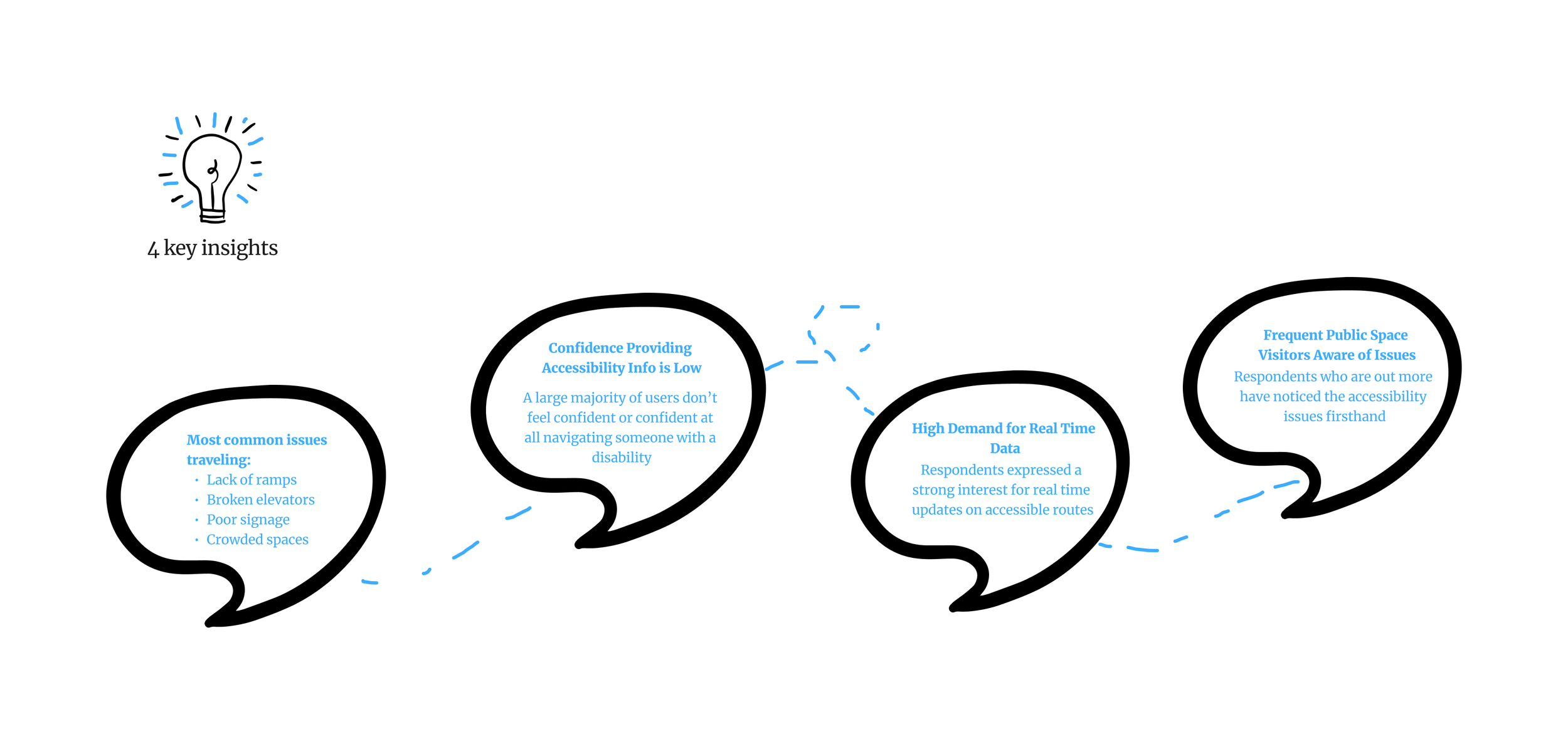
User ResearchConducted a survey with 20+ responses
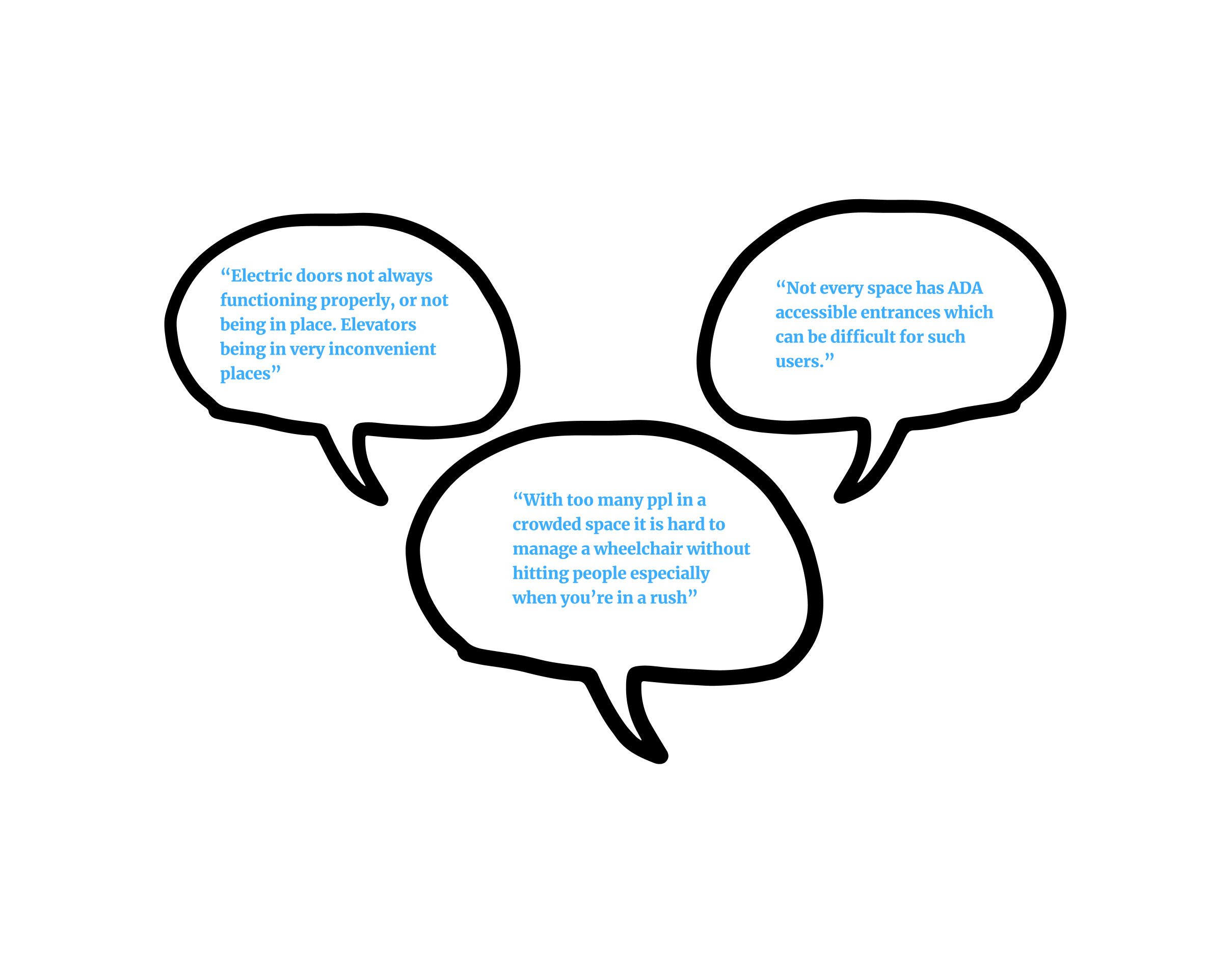
Users left several important comments regarding this field. Their feedback highlighted common frustrations around inaccessible pathways and the lack of reliable information when planning routes. To better understand how I could fill gaps in the current market for navigation app accessibility, I conducted interviews with people who either have a disability or frequently travel with someone who does. From these surveys, I identified several key insights:

Confidence Level
The survey led to several notable conclusions that directly informed our design priorities. By analyzing both the quantitative data and open ended responses, I uncovered consistent themes around confidence, awareness, and accessibility needs. Below are some of the most relevant insights visualized through pie charts:
Knowledge
User Personas
Upon analyzing my research, I developed two user personas expressing their goals, frustrations, and pain points. These personas help me better understand the diverse needs of both wheelchair users and those who support them, guiding the design of a more effective and inclusive accessibility app.


After compiling the interview data and key insights, I was better able to comprehend the desires and needs of users when it came to accessible travel. It became evident what the 3 most aching pain points were in need of handling:


IdeationDesign Process and Brainstorming
Through our initial efforts, I identified key features for the platform and mapped out foundational architecture to guide its structure. In this process, I realized that a typical navigation app’s user flow is very simple.

Low Fidelity Prototypes
Based on user feedback and ideation, I sketched low-fidelity wireframes to explore flows, layouts, and features. These prototypes helped validate what accessibility information users needed most and how they preferred it to be presented.
IterationsDesigning User Friendly Interfaces
To create a seamless navigation experience for wheelchair users, I went through multiple iterations of both the location detail page and the active directions page. Each round of design aimed to improve clarity, accessibility, and overall usability based on core user needs. It was a challenge determining what exactly each of these screens needed.
Navigation Page Iteration
The navigation screen needed to not only show a clear route but also highlight potential obstacles in real time. Our goal was to support users who may be actively navigating a busy or unfamiliar area, often with limited attention or time. The first version showed the path and obstructions but lacked an end navigation button and didn’t explain the meaning of the icons. Option 2 introduced an “End” button, which improved usability, but still left users confused about the iconography.

Ultimately, I chose Option 3 for its combination of functional completeness and improved clarity. By adding icon labels and keeping key controls easily accessible, the final version offered a more intuitive and reassuring experience for wheelchair users on the move.
Location Page Iteration
For the location page, the challenge was determining how to present accessibility information in a way that felt useful without overloading the screen. The goal was to balance visual simplicity with contextual depth; allowing users to quickly assess a place’s accessibility features before deciding to visit. Option 1 focused on a clean layout, but lacked important information such as address or hours, and felt visually disconnected. Option 2 introduced those details but still felt cluttered and unstructured.

In the end, I selected Option 3 for its clear hierarchy, layered composition, and its action oriented layout. User testing showed that the addition of a dedicated “Call” button and segmented data improved both task completion and visual flow. Overall, this iteration offered the best balance between visual hierarchy and utility.
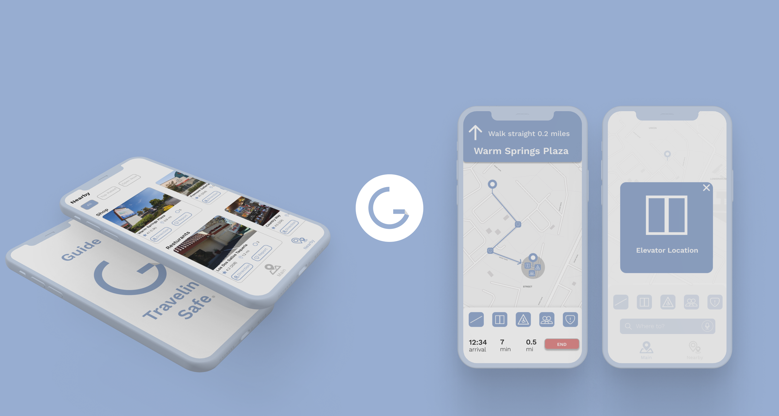
Final DesignSolved Pain Points
During the design process, I identified the most effective way to clearly communicate the accessible features of a route. I incorporated 5 main pinpoints along a route: elevators, ramps, large crowds, handicapped bathrooms and an additional feature to report something.

To build trust and confidence for the user, the application only uses the most accessible route with the least detours or interruptions, prioritizing paths that are maintained well, clearly marked, and verified by recent user feedback. Users can view detailed information about each route, including elevator status, ramp conditions, and any reported obstacles. This ensures they can travel with greater independence, certainty, and reduced stress in unfamiliar environments.


Final Prototype

Design Kit
Reflection & Next StepsOpening my third eye
Working on this project deepened my understanding of how digital products can bridge gaps in accessibility in the real world. Designing for users in motion challenged me to simplify everything down to the essentials, focusing on core needs.
Reflection
Taking on this solo UX project gave me the chance to lead every stage, from research to prototyping. I not only strengthened my design process, but developed a deeper awareness of the daily navigation challenges people in wheelchairs face. In future iterations, I’d love to expand on Guide’s capabilities to include a wide array of accessibility content. Additionally this project holds meaning to me and something that is very personal, glad it worked out well.