
SureCall and Verizon Mobile Application
Team
1 PM 2 Back End Engineers 1 Designer
Role
UX Designer
Skills
Wireframing Prototyping Design Systems Interaction Design Information Architecture
Timeline
10 weeks
Tools
Figma Slack FigJam

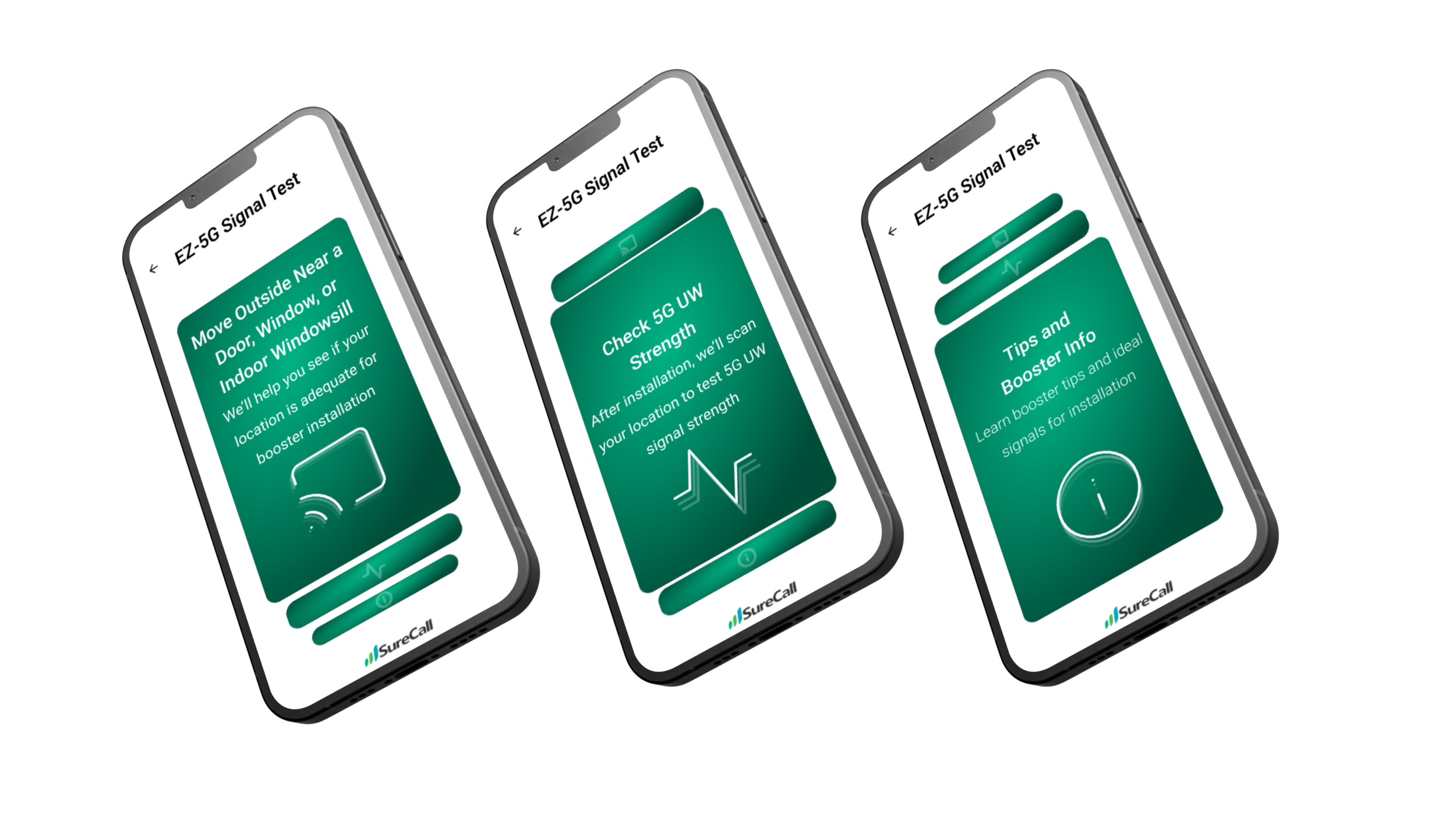
ContextWhat is the EZ-5G Signal Test App?
SureCall partnered with Verizon to design a mobile tool that helps users identify the optimal location for installing a 5G booster. The app guides users through three core features: signal testing at a physical location, confirming successful booster installation with live strength updates, and educating users with intuitive tips about 5G UW technology and booster setup. Designed with field use in mind, this tool needed to be fast, friendly, and built for utility over complexity.
Project Vision
Setups for 5G boosters are often done in tough environments such as garages, basements, or rural areas with weak signal visibility. Technicians and homeowners needed an app that simplified the decision making process around placement and gave immediate feedback about booster performance. Verizon’s goal was to reduce support calls by empowering users with clear instructions and feedback tools within a focused step by step app.
Challenges
1) Translating live signal data into a visual and user friendly format.
2) Educating users about technical signal concepts like 5G WU without overwhelming them.
3) Designing for low friction: users in the field might be climbing ladders or holding tools while operating the app.
ProblemHow can we help users confidently choose where and how to install a signal booster?
When working with hardware like signal boosters, decisions about installation often come down to guesswork, particularly for users unfamiliar with signal metrics like dBm. SureCall and Verizon identified a need for a support tool that would take the ambiguity out of this process and make it easier for anyone to complete setup successfully without relying on customer support or lengthy manuals.
User ResearchFeedback from SureCall and Verizon Project Managers
Although I did not collect any direct user research, I was given a list of important topics to cover:
Most of their clients don’t know what a good or bad dBm value meant.
People wanted to “see it work” in real time, helping build trust in the tech.
Technical instructions needed to be skimmable, with optional depth.
User Personas
Upon analyzing our research, we developed two user personas expressing their goals, frustrations and pain points


After compiling the interview data and key insights, we were better able to comprehend the desires and needs of students when it came to their music taste. It became evident what the 2 most aching pain points were in need of handling:

IdeationDesign Process and Brainstorming
Through our initial efforts, we identified key features for the platform and mapped out the foundational information architecture to guide its structure.

Low Fidelity Prototypes
Given the feedback conducted with my project manager and Verizon, I sketched out low fidelity concepts to help explore user flow, potential screens, and features to better address the concerns and specific needs of users

IterationsDesigning User Friendly Interfaces
After completing the low fidelity prototypes, we progressed to mid fidelity designs. Defining the key information for each screen proved challenging and required careful decision making. By addressing the aesthetic usability effect, we were able to create well balanced layouts that enhanced both clarity and user experience.
Information Page Iteration
For the information page, we faced challenges in determining how best to explain 5G Ultra Wideband in a clear and accessible way. Given the presence of technical terms throughout the app, this page was designed to bridge knowledge gaps and ensure users, whatever background, could confidently understand the technology.

In the end, I decided to go with Option 3 for its strong balance between visual appeal and information clarity. User testing confirmed that the color choices enhanced the overall experience, making the content more engaging. The combination of visual cues through both text and color contributed to the effectiveness of the design. Additionally, the gradient blob containing the text improves scannability, especially for users navigating quickly.
Signal Page Iteration
For the signal page, we faced challenges in determining what was the information that needed to be on the page versus what could be on it. This page is meant to test the signal of the booster once the user has installed it already.

In the end, I chose Option 2 for its streamlined functionality. Rather than relying on a “Test Again” button, the app automatically rescans the user’s location for a booster signal, enhancing usability by minimizing user effort. Including a “Learn More” section on this screen was deemed unnecessary, as it diverted attention from the screen’s primary purpose. Instead, a “Close” button was introduced to guide users back to the home screen. Terminology was refined for clarity, and RSRP values were incorporated to add technical accuracy.
Final DesignSolved Challenges
During the design process, we tackled several user challenges to improve ease of use and clarity. To boost confidence during setup, we introduced instant testing tools that delivered feedback within seconds, helping users feel reassured and avoid second guessing. This feature is very user friendly and doesn’t require a high level of understanding from the user.
To make signal strength easier to understand, I used a visual meter with color coded tiers and clear labels like “Good” and “Great,” translating technical values like -80 dBm into something intuitive. For better accessibility in the field, we prioritized large tap targets, clean layouts, and step-by-step screens, making the app easy to use.

Final Prototype

Design Kit
Reflection & Next StepsOpening my third eye
Working on this project deepened my understanding of how UX can bridge digital interfaces and physical environments. Designing for non ideal conditions from bad lighting to a user on the move challenged me to make every screen hold meaning.
Reflection
Working in a start up environment for a small to medium sized company was a great experience. I really got to be hands on with every step of this process along the way. I not only enhanced my design skills but learned something about cellular boosters as well. Additionally, I got to work with back end engineers to see how the engineering actually took place. They recommended things for me to change or add based on how easy/hard it was to code an element. This was definitely a challenge for me but worth all of the hard work. Thank you SureCall for having me!