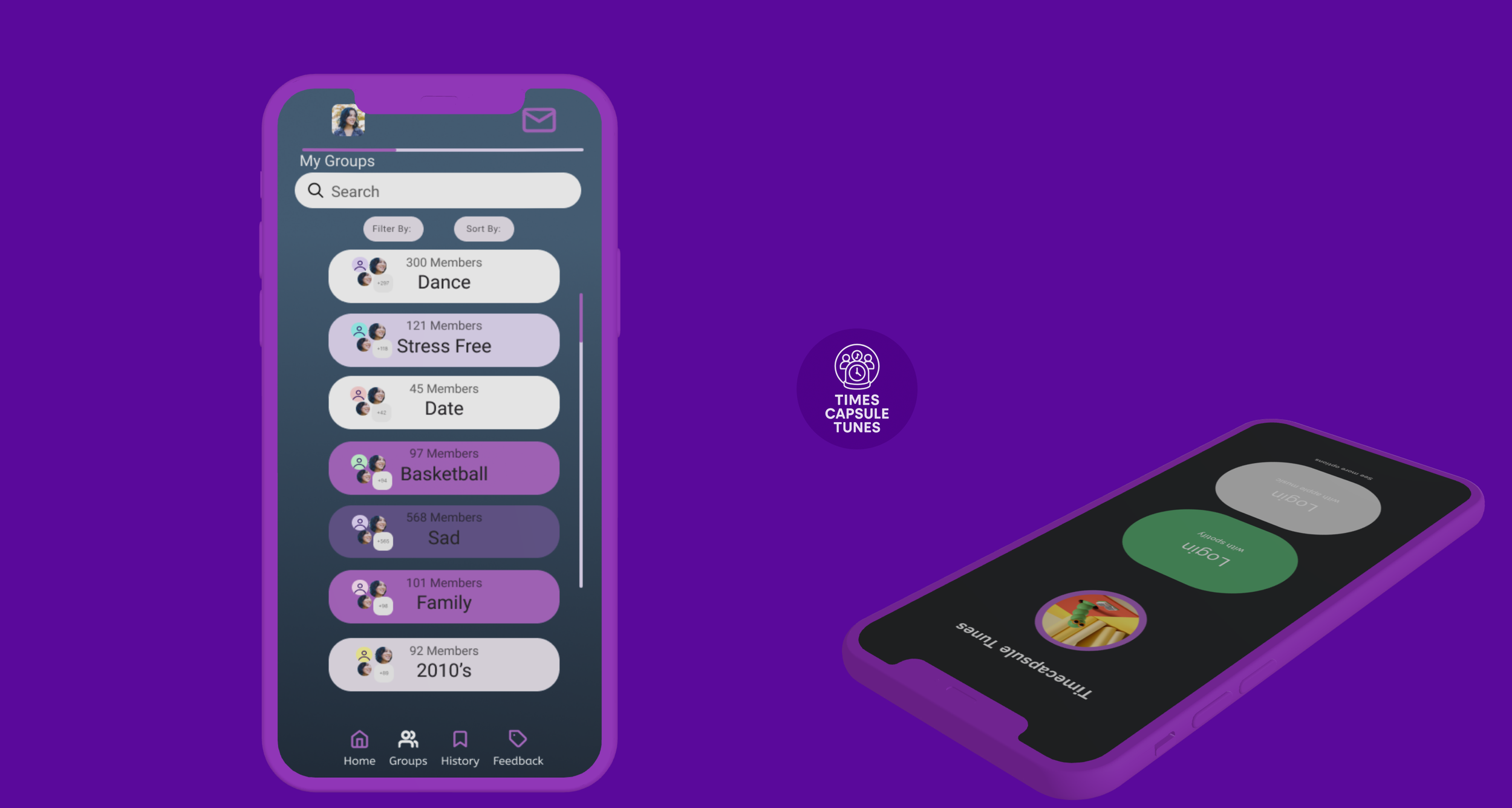
Timecapsule Tunes Mobile Application
Role
UX Designer
Timeline
8 weeks
Team
1 PM 1 Back End Engineer 1 Designer
Tools
Figma Slack FigJam Python Spotipy (API)
ContextWhat is Timecapsule Tunes?
Time Capsule Tunes is a social app that connects users based on shared music tastes. In addition to group creation and chatting, the app uses Spotify’s API to recommend music, helping spark conversation and new friendships. As this was my first project within the industry, our goal was to build a fun, lightweight space where users can meet others with similar tastes and discover new music through conversation.
Skills
Wireframing Prototyping Design Systems Interaction Design Information Architecture
Project Vision
Many platforms like Spotify and Apple Music focus on music discovery as a solo experience. Students at the University of Michigan shared they wanted to connect with others over music. Current tools either lacked social features or were too chaotic for casual users.
Challenges
1) Unclear what type of social experience users really wanted; whether it was individual connections, large forums, or small groups.
2) Difficult to find a feature that made the application stand out to its competitors.
3) Early prototypes risked overwhelming users with too many features at once.
ProblemIt’s hard to find spaces dedicated to finding groups based on music
As someone who loves music, I’ve struggled to find dedicated platforms that make it easy to connect with others who share similar music tastes. While applications like Reddit and Discord offer spaces for discussion, they aren’t built specifically for fostering connections based purely on musical interests. Recognizing this gap, a group of students at the University of Michigan set out to create a solution. We thought to ourselves: How can we design a platform that enables users to discover, connect, and collaborate with others through shared music preferences making music the central driver of social interaction?
User ResearchConducted a survey with 40 responses and interviewed 8 students
To better understand how we could fill gaps in the current market for social music platforms, I conducted interviews with university students and casual music enthusiasts. From these conversations, my team and I identified several key insights:
Music Bond
Community
User Personas
Upon analyzing our research, we developed two user personas expressing their goals, frustrations and pain points
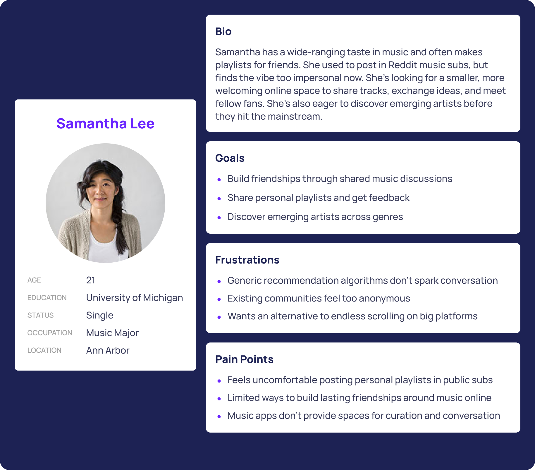
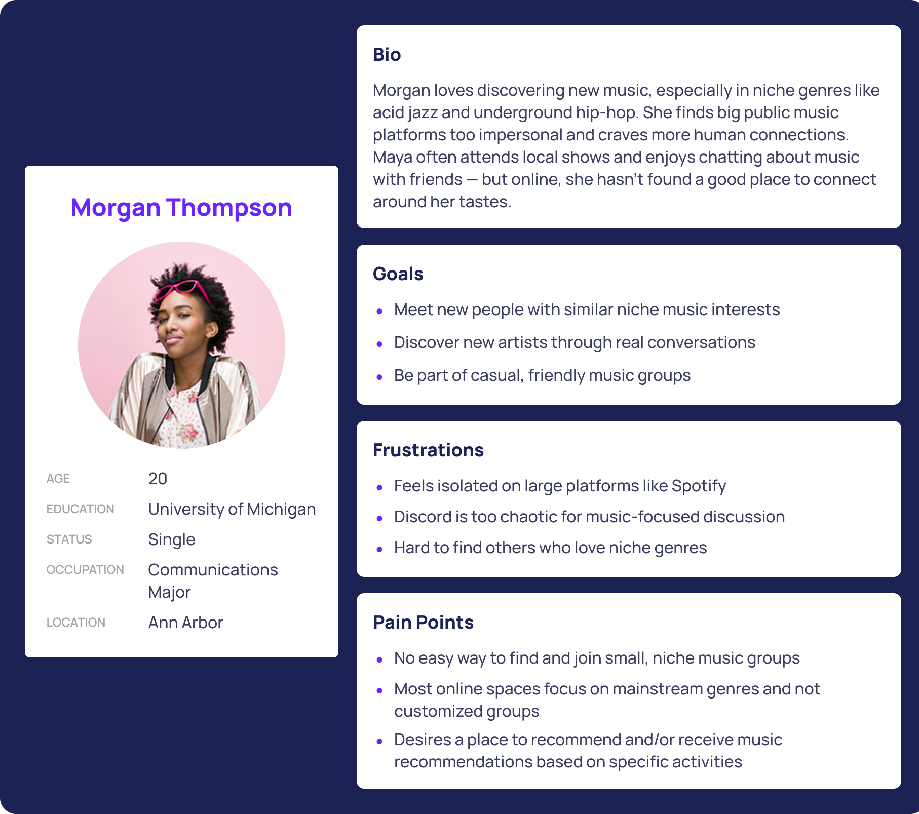
After compiling the interview data and key insights, we were better able to comprehend the desires and needs of students when it came to their music taste. It became evident what the 2 most aching pain points were in need of handling:


IdeationDesign Process and Brainstorming
Upon our efforts thus far, we concluded what we wanted some of our key features to be and mapped out the initial information architecture of how our platform was going to be structured
Low Fidelity Prototypes
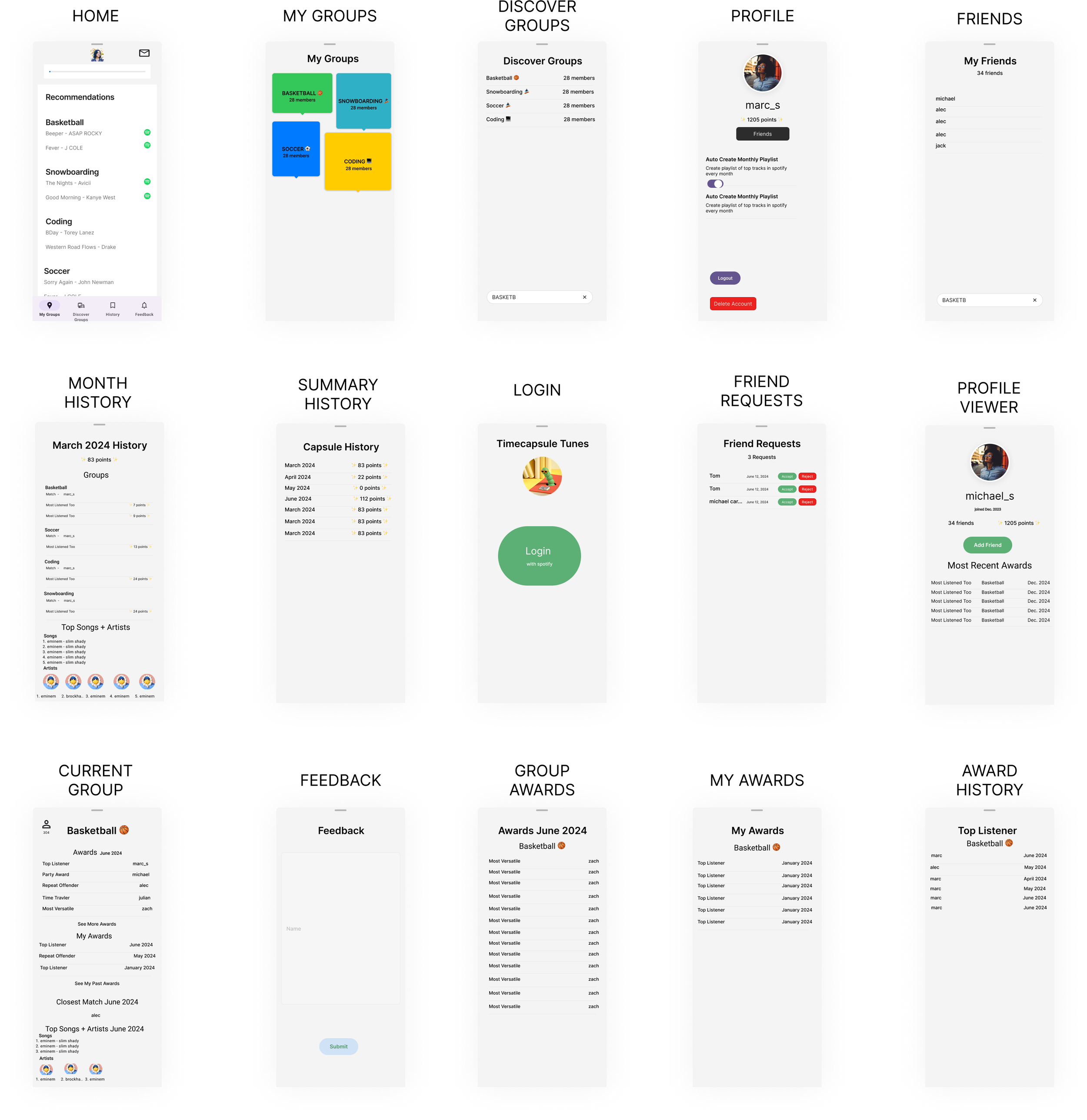
Given the results from our conducted interviews, I sketched out low fidelity concepts to help explore user flow, potential screens, and features to better address the concerns and specific needs of fellow passionate music enthusiasts
IterationsDesigning User Friendly Interfaces
After completing the low fidelity prototypes, we moved on to mid fidelity designs, where we struggled to determine the specific content for each screen. This challenge led to an increased number of screens, which in turn added complexity to the user’s navigation experience.
Home Page Iteration
For the homepage, we faced challenges in determining what content we wanted to display exactly. We decided on recommending music based on what you have been listening too and a discover groups preview as well.

In the end, I chose to go with Option 3 because it offers the most balanced approach between clarity, structure, and visual hierarchy. While Option 1 felt overwhelming and Option 2 lacked depth, Option 3 successfully organizes information in a way that feels both intuitive and visually digestible. The use of dropdowns, consistent spacing, and Spotify icons enhances usability without cluttering the screen. Including a group preview section also adds context and encourages user engagement. Overall, this version best supports quick navigation while still delivering a polished, engaging experience.
My Groups Iteration
On the My Groups page, we encountered challenges in determining the optimal layout and deciding which features to implement to ensure the best possible user experience.
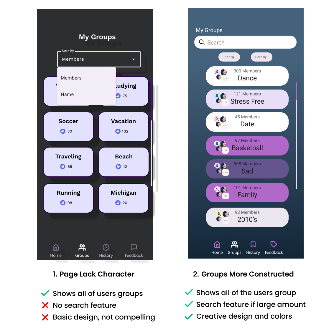
In the end, I chose Option 2 for its improved structure, visual clarity, and enhanced user support. Compared to the more basic and unengaging layout of Option 1, this version introduces a search bar and organized filter/sort features that streamline the user’s ability to manage and locate groups. The colorful, rounded group containers not only create a more compelling visual hierarchy but also improve scannability. By combining function with creativity, Option 2 delivers a more polished and intuitive experience while still maintaining access to all user groups.
Final DesignAddressing Pain Points and Challenges
In this iteration, users are given the opportunity to:
dedicate areas for music recommendation based on activities
customize groups tailored to your desire
easily find and join music related groups
build music friendships online
provide space for “curation and conversation”
all genres included and any playlist can be made
Solved Challenges
Throughout the design process, we addressed several key user challenges. First, we defined what users truly wanted—smaller, more focused groups dedicated to collaboration and shared music interests. To support this, we introduced a "Discover Groups" page, where users can browse or search for communities, filter by name or member count, and engage in endless scrolling to explore options. Additionally, the "My Groups" page was created to house all the groups a user has joined for easy access.

Second, to foster engagement and recognize user activity, we implemented a badge system that awards users for various achievements, such as total listening hours, most listened to artists, tracks, genres, and playlists. Lastly, to prevent information overload, we intentionally spread content across multiple pages, ensuring a cleaner and more digestible user experience.

Final Prototype
DevelopmentBackend:
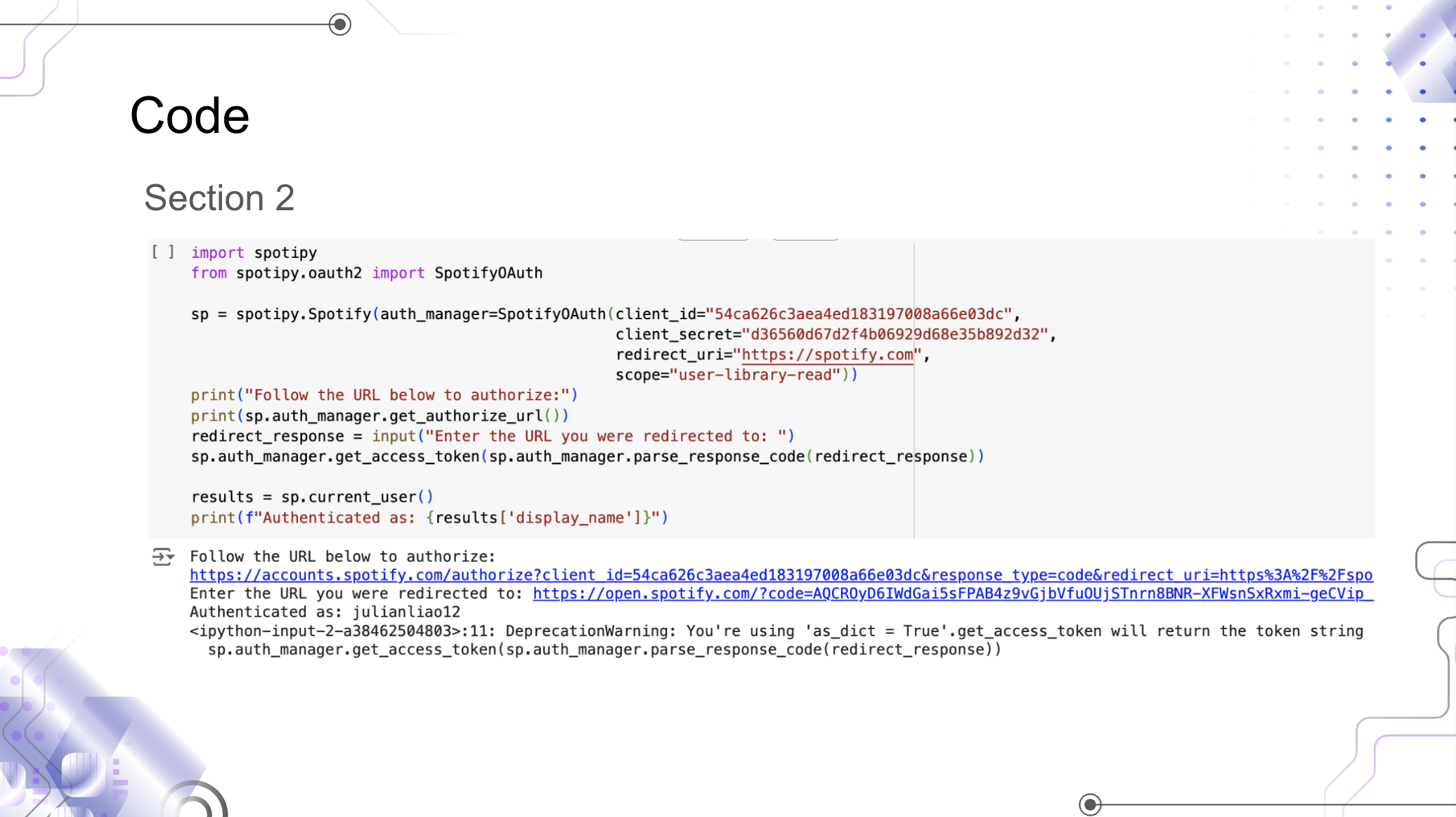
Built using Spotipy to pull genre based recommendations. Stored user group and profile data in JSON for simplicity.
Tech Highlights:
Python + Spotify API
Lightweight JSON database
Responsive, mobile friendly design
Core Algorithm:
User selects genres of interest
Matches with groups and users
Uses API powered tool to pull suggestions
Click here for code:
Reflection & Next StepsOpening my third eye/Reflection
Time Capsule Tunes introduced me to the world of UX Design. The app reinforced my passion for designing for community. I learned how much social UX is about crafting safe, fun spaces for people to connect not just pushing features. It was very rewarding applying my creative efforts to benefit others. Although the team wasn’t very structured and made up of college students, I got to see what it was like to work on a UX team in a way. Very glad for this experience!
Potential next Iterations:
For future iterations, we plan to introduce in app notifications to keep users informed about new group activity and engagement. Expanding music sharing beyond Spotify, including platforms like YouTube, will allow for greater flexibility and inclusivity. We also aim to add features for hosting events and virtual listening parties, encouraging real time interaction among users. These updates will help strengthen community bonds and enhance the overall user experience.
